Five Thoughtful Designer Storefronts

Before my interest in fashion and handbags really took off, my main aesthetic concern was architecture. As my interest in fashion began to develop, I found myself making pilgrimages to the various physical locations of the designers whose work I most appreciated, and I was pleasantly surprised to find that many of them take great care to create sophisticated, often playful, facades for their stores. In an effort to exalt the connections between architecture and fashion, I am excited to share with you five thoughtful designer storefronts.

1. Hermès, Amsterdam
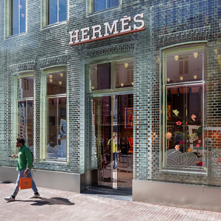
Customer leaves Hermès in Amsterdam with the coveted orange bag. Image  Via
Customer leaves Hermès in Amsterdam with the coveted orange bag. Image Via

Hermès made headlines in 2019 when, in Amsterdam, it opened a two-storey boutique in a building with a facade composed of glass bricks. Designed by MVRDV as a townhouse, and once occupied by Chanel, the glass facade of the store immediately fascinates passersby who can look through the wall and make out shapes and colors inside of the store. The structure known as Crystal Houses, which occupies a prominent plot on one of Amsterdam’s most well-known retail streets, seems to challenge both the architectural homogeneity of the street as well as Hermès’ own conservatism.


2. Dior Flagship, Paris
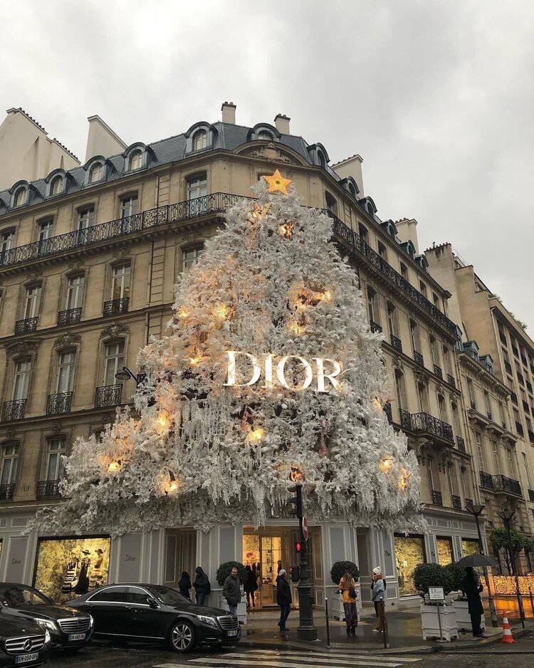
Pedestrians pass under the frosted limbs of Dior’s Christmas installation in Paris. Image  Via
Pedestrians pass under the frosted limbs of Dior’s Christmas installation in Paris. Image Via

Dior’s Paris flagship store, located on the Avenue Montaigne, is known for reinventing its facade with each passing season. Though every iteration of the store’s facade is worth talking about, Dior absolutely shattered expectations with it’s Christmas 2018/2019 installation; an elegantly proportioned, yet all-consuming white Christmas tree which glowed a warm yellow at night and shielded customers as they entered and exited the boutique. Though I’ve attached my favorite photo of the tree, I think it’s well worth your while to Google this one and browse further.

3. Louis Vuitton, New York and London
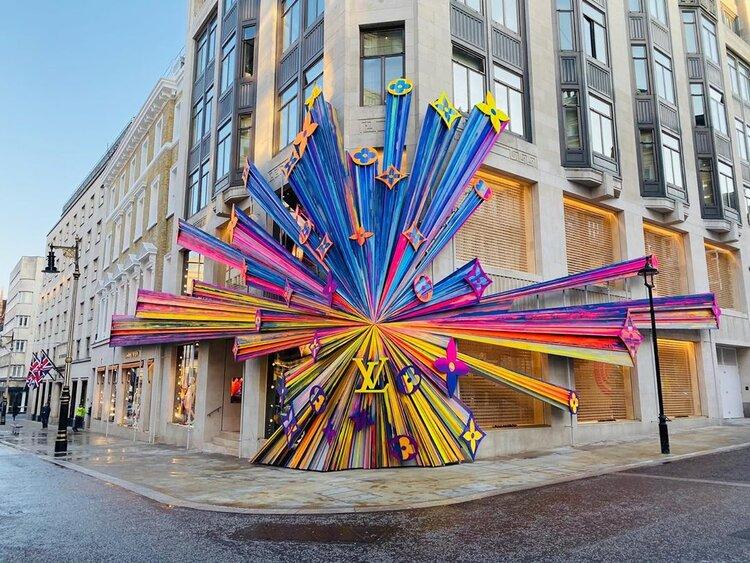
Three-dimensional Louis Vuitton monogram in London. Image  Via
Three-dimensional Louis Vuitton monogram in London. Image Via

Two storefronts well known for their constant reinvention are Louis Vuitton’s New York and London flagships. As with Dior, it is certainly true that every Louis Vuitton location adopts a universal, seasonally changing design language to keep each location recognizable and current. But while Dior makes its biggest statement in Paris, Louis Vuitton goes all out in Manhattan and London. Under the visual creative direction of Faye Mcleod (@fayedreamsaloton instagram), a new, colorful, three-dimensional explosive look was created for the LV monogram.

This new visual was painted onto the 10+ storey facade of Louis Vuitton’s Midtown Manhattan location, and was rendered in metal and attached to scaffolding at LV’s New Bond Street location in London for a genuinely three-dimensional experience. This 3D rainbow monogram motif was also installed in Louis Vuitton boutique windows across the world, taking the shape of hearts, orbs, and even a full size Christmas tree in LV’s Place Vendôme location in Paris.


4. Goyard, Monte Carlo
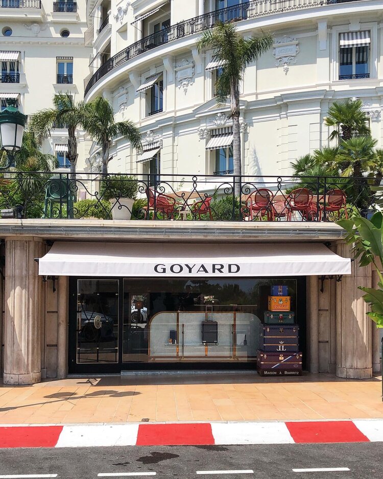
The facade of Goyard’s Monte-Carlo flagship, fronted immediately by the Monaco Grand Prix circuit. Image  Via
The facade of Goyard’s Monte-Carlo flagship, fronted immediately by the Monaco Grand Prix circuit. Image Via

Having had an intermittent presence in Monte-Carlo since the end of the 19th century, Maison Goyard has recently returned, opening up at an address along the city’s famed Avenue de Monte-Carlo. While I am appreciative of the storefront itself (a pared down, monochromatic single-storey glass and stone facade with immaculate white awnings printed with “GOYARD,” the whole store topped by a lush pedestrian walkway), the store’s location is much more interesting. As can be seen in the photograph, the store sits right along the famous route of the Formula 1 Monaco Grand Prix—perhaps the single most important circuit in Formula 1 since its inauguration by Prince Pierre in 1929. The physical situation of the store not only implicates it in the excitement of nearly a century of sporting history, but also ensures that the Goyard banners will be seen anytime filming occurs along the track.


5. Burberry, Chicago
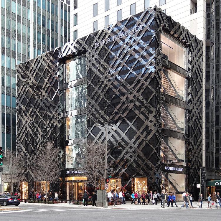
The Burberry storefront situated on Chicago’s famous Magnificent Mile. Image  Via
The Burberry storefront situated on Chicago’s famous Magnificent Mile. Image Via

Finally, as MODA is based in Chicago, I feel that it is only fair to include a storefront from our very own city. It may not come as a surprise to Chicagoans that I have selected Burberry on the Magnificent Mile. Positioned across from The Roastery, the largest Starbucks location in the world, is the glossy, midnight black Burberry boutique. At first glance, it appears to be simply a large and tall volume, cut up the center by windows that display products and ad campaigns. What one finds upon closer inspection, however, is that the building is actually festooned with the historical Burberry check, rendered three-dimensionally to stand out slightly from the building itself. Even more spectacular is the bright white light which emanates from behind the check at night, casting an elegant yet whimsical glow against the polished structure.


The next time you find yourself window shopping or looking for something in a store, take some time to appreciate your physical surroundings, because someone spent a great deal of time designing the visual impact with you in mind.

Featured Image via

Tagged : / /

The Bauhaus Movement’s Complicated Chicago Story

The Art Institute’s centenary exhibit on the Bauhaus provides a refreshingly critical retrospective on the movement’s complicated relationship with Chicago.

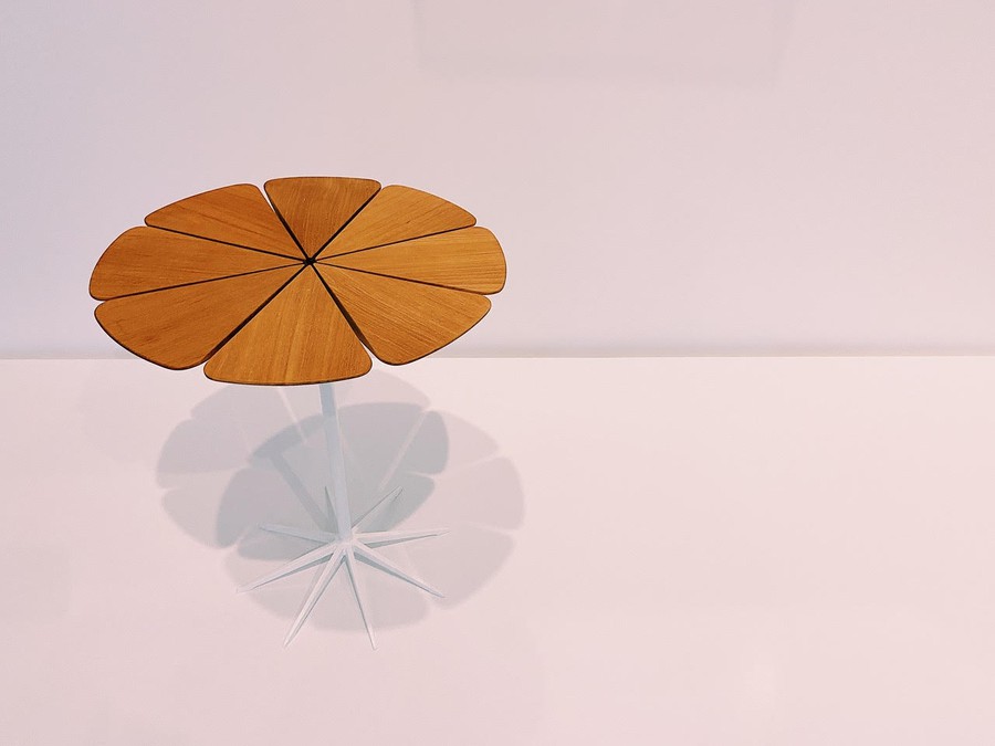
Petal Occasional Table by Richard Shultz for Knoll Associates

When Nazi Germany forced the Bauhaus school of design in Weimar, Germany to permanently close its doors in 1933, many of its members felt that their revolutionary work in design was unfinished. Resolved to continue the work begun by the Bauhaus and its famed professors, such as Wassily Kandinsky and Walter Gropius, a group of instructors took root in the United States, taking particular interest in Chicago and the American Midwest. Among these transplants were Ludwig Mies van der Rohe and László Moholy-Nagy, who were both invited to teach at the New Bauhaus, now the Institute of Design (ID) at the Illinois Institute of Technology (ITT). Beginning in the mid-1930s, Moholy-Nagy and Mies created a modernist legacy in architecture and the arts with the help of their pupils and contemporaries. Their influence is still deeply felt in Chicago to this day.

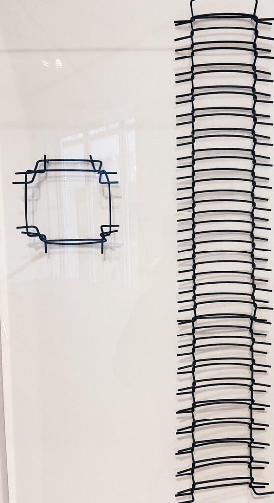
 Because the media has extensively covered superstar figures such as Moholy-Nagy and Mies, it is quite refreshing to see an exhibition focused largely on the works of their previously anonymous students, emerging a century after the founding of the original Bauhaus. Importantly, many of the lessons taught at both the original Bauhaus and its American schools dealt with the qualities and characteristics of individual materials, favoring intimate interaction with objects and great design over formal artistic or architectural training. As such, many of the pieces on display in the small but densely populated space at the Art Institute are vaguely architectural but maintain a deeper focus on the simple form and materiality of everyday objects within the industrial context of the 20th century. This philosophy is readily apparent in works such as Institute of Design Foundation Course Wire Exercise, in which a delicate wire-framed sculpture vaguely references industrial hallmarks, like skyscrapers and metalworking. Similarly, Hall of Sport and Culture, Collage, dated from the early 1970s, features a football player, a pair of dancers, and a crowd set within the context of what appears to be a sort of building, itself resting on color blocks. In fact, the work was equally inspired by a building in Detroit as it was by modern art, film, and the emerging technique of collage.

The exhibit also seeks to correct for the historical lack of recognition of the many women who studied in the Chicago Bauhaus schools. One such figure who is featured prominently is Dori Altschuler, whose work during her time at the ID recently received recognition from several national publications, as well as from the journal Arts & Architecture in 1952. Altschuler’s use of recycled shopping bag materials to make architectural sculptures is particularly interesting within the contemporary context of natural resource conservation, as it seems that she—and the Bauhaus movement in general—was well ahead of her contemporaries in understanding the existential threat that urbanism and modernization posed on the planet’s natural resources.

image
Flexible Interlocking Structures, Dori (Hahn) Altschuler

Despite their innumerable contributions to design, architecture, and art, the Bauhaus’s insistence on unified, homogenous urban spaces master-planned by privileged Europeans and Americans allowed for the creation of troubling projects, notably on Chicago’s South Side. Enacting a plan that eerily recalls Georges-Eugène Haussmann’s classist transformation of Paris during the 19th century, Mies and IIT demolished large tracts of land on the South Side, displacing large populations of low-income Black families and businesses under the guise of “urban renewal.” The effects of this process are still glaringly obvious today, when the de facto segregation of wealthy, white Chicagoans and low-income Black Chicagoans remains an unsolved issue. Standing almost as an allegorical testament to this shameful period, Mies van der Rohe’s School of Social Service Administration, completed in 1965 for the University of Chicago, sits prominently along 60th Street, which has long represented the border between the vast property of the University and its wealthy inhabitants, and the Woodlawn community occupied primarily by low-income residents of color.

Viewing the contributions and controversies of the Chicago Bauhaus era in equal proportion, Bauhaus in Chicago: Design in the City presents perhaps the most comprehensive and most progressive retrospective on the movement. On view through April 26, 2020 in Gallery 283 of the modern wing, this show is not one to miss.

Tagged : / / / / /

Luxury Train Travel in the East

When one thinks of luxury travel, a certain set of assumptions usually come to mind. First class plane tickets, glamorous and lavishly appointed hotel rooms, exotic restaurant experiences, and European destinations, to name a few. However, for those travelers who have become disillusioned or simply bored with the quintessential European vacation, there are luxury trains, and specifically luxury trains in the Eastern Hemisphere. Offering stunning views, seasonal & local cuisine, and a fresh perspective on immersion in some of the world’s most interesting locales, vacations by rail are the new way to see the world. Having become bored with the standard vacation myself, I stumbled upon luxury train travel on YouTube and was instantly hooked, so it is with great enthusiasm that I present these exciting alternative adventures.

1. The Seven Stars Kyushu

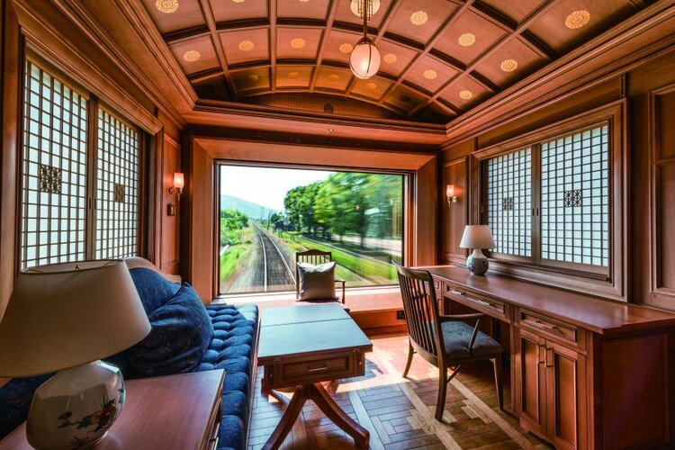
For those who wish to indulge in a luxurious yet unpretentious rail vacation, The Seven Stars in Kyushu sets the bar. Situated on the island of Kyushu, Japan’s third largest island, The Seven Stars in Kyushu has aimed to take advantage of the island’s natural splendor since 2013, and gains its unique name from the seven prefectures on the island of Kyushu. In another nod to its namesake, The train contains seven cars and 14 guest compartments, allowing for a maximum guest occupancy of 28 which ensures that each guest has the opportunity to revel in all that the train has to offer. Trips range from 2 days & 1 night to 4 days & 3 nights, including stops at various prefectures throughout the island which allows guests the opportunity to experience both the island’s stunning natural beauty and cultural richness at close range, though one may just as well opt to stay on the train and take in the landscape through the floor-to-ceiling windows in certain cars. To that end, The Seven Stars is replete with amenities which allow guests to reflect on their experiences in an atmosphere consciously created to harmoniously blend Japanese and Western design; guests can socialize and drink in the Blue Moon saloon car, or experience seasonally changing local cuisine in the sophisticated atmosphere of the Jupiter dining car. Because of the seamless blend of Japanese hospitality and dramatic scenery, potential guests of the Seven Stars in Kyushu are chosen by lottery and typically book several years in advance, despite the fact that tickets can cost in excess of $10,000 U.S.

Image  Via
Image via

2. Shiki-Shima

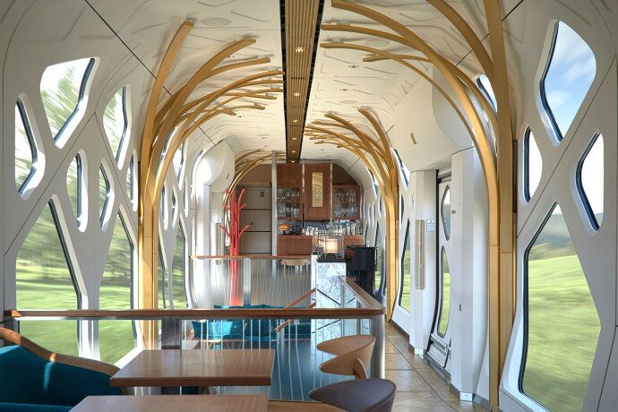
Taking a decidedly more modern approach to luxury train travel, the Train Suite Shiki-Shima explores the interior of eastern Japan on trips ranging from 2 days & 1 night to 4 days & 3 nights. The train’s unusual exterior appearance belie its spectacularly airy interior which consists of unparalleled views from each of its 10 cars which can house a maximum of 34 guests. In fact, a quick visit to the train’s website will reveal the terrace cars, two cars on the front and end of the train which are shaped to optimize the views of the passing terrain, and it should also be mentioned that the movie featured on the website is well worth your time. While the Seven Stars in Kyushu tops the list for its seamless blending of old & new, Japanese & Western, those who want a more modern experience will likely prefer this option.

Image  Via
Image via

3. Maharaja’s Express

For those seeking a much more opulent experience that makes little concession to modesty, there is the Maharajas’ Express in India. With longer trips averaging 7 days & 6 nights, Maharajas’ Express is already a leading option for those who want a more comprehensive rail vacation. Overtly recreating the opulence of the Royal Era in India, the train is laden with red carpets, jewel-studded beds, and each of the 14 guest carriages is even named after the precious jewels of various Maharajas. Routes available to guests on the Maharajas’ Express center around visits to a number of India’s greatest commercial centers, or visits to historical sites of Indian royalty. Of particular sensory interest is the Mayur Mahal restaurant car, where guests are transported to a bygone era of luxury dining complete with luxuriously embellished furniture and soft, golden lighting.

Image  Via
Image via

4. Rovos Rail

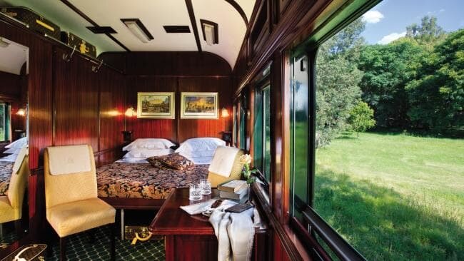
Currently celebrating its 30th year in operation, South Africa’s Rovos Rail operates eight different routes, in addition to special packages. The Rovos Rail can carry a maximum of 72 passengers, making it the most accessible of all the trains on this list. A unique and distinguishing feature of Rovos Rail is it’s history of bringing storied and decommissioned train cars back into service, interesting both for the novel and historic experience this engenders, but also because it recycles train cars rather than necessitating the production of new ones, and though sustainability is not a focus of Rovos Rail or of the luxury train industry in general, Rovos Rail seems to be setting a precedent here that should be followed by the luxury train industry if possible. If one wishes to see South Africa in a way that not many have, Rovos Rail is a prime option.

Image  Via
Image via

Featured image via

Tagged : /

Bringing Mexican Mid-century Modernism to the Fore

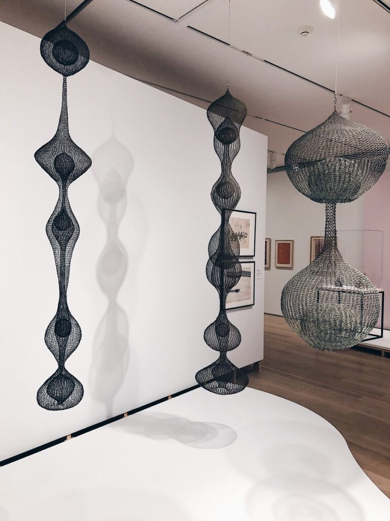
Ruth Asawa's famous looped-wire sculptures, currently on display at the Art Institute of Chicago.
Ruth Asawa’s famous looped-wire sculptures, currently on display at the Art Institute of Chicago.

For those not well-versed in the history of design, midcentury modernism carries associations with places like Germany, Sweden, and Southern California, but the link between modernism and Mexico is less obvious. The Art Institute of Chicago’s exhibition In a Cloud, in a Wall, in a Chair: Six Modernists in Mexico at Midcenturyseeks to change that. By showcasing the works of six artists (Clara Porset, Ruth Asawa, Cynthia Sargent, Sheila Hicks, Anni Albers, and Lola Álvarez Bravo) who lived or worked in Mexico between 1940 and 1970, this exhibition encourages conversation around Mexico’s contributions to modernism by locating the commonalities between these artists. 

The exhibition takes its name from a quote by Clara Porset, who immigrated to Mexico in 1935 as an exile from Cuba. During her 1952 exhibition, Art In Daily Life, Porset declared, “There is design in everything…in a cloud, in a wall, in a chair, in the sea, in the sand, in a pot.” Along with the other artists on display, Porset was working at a crucial time in Mexico’s design history, a time when the Mexican government was working to establish a recognizable and cohesive design identity.  

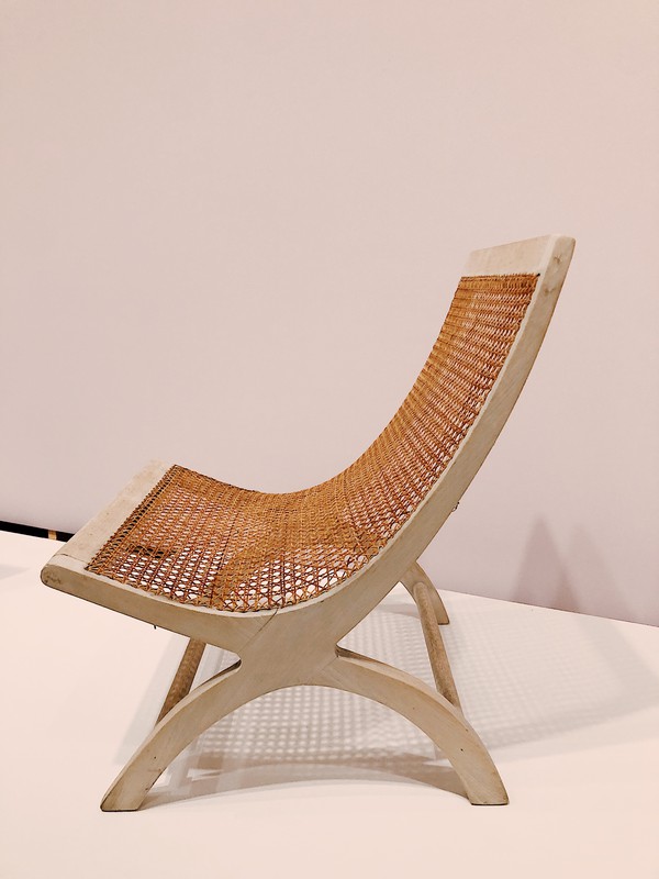
Combining traditional Mexican craft methods with newer, technologically driven techniques, Porset took her vision to the public, using furniture to express the daily lives of Mexicans. Porset’s Lounge Chair, for example, was conceived in the 1950s and was used for decades at Acapulco’s famed Pierre Mundo Imperial hotel. One of Porset’s most famous works, the Butaque Chair, infused new life into a traditional Latin American design by incorporating materials such as plant fibers and leather which made the chair suited to Mexico’s different climates. In line with the modernist ideals of the time, Porset also worked to ensure that her versions of the Butaque Chair were mass-producible and affordable. 

image
Clara Porset’s Butaque chair, on display at the Art Institute of Chicago.

In contrast to Porset, the works of Ruth Asawa were not primarily functional, but rather overtly sculptural. Like several of the other artists exhibited at the Art Institute, Asawa spent her formative years at Black Mountain College in North Carolina, where she initially began exploring looped wire as a means of creating minimalistic, organic forms. It was only after her move to Mexico that Asawa learned her defining crochet loop technique, initially employed for the creation of egg baskets, but later used to produce wire sculptures. Reminiscent of the movement of water or even a spider’s web, these looped-wire sculptures can be seen hanging from the ceilings of many museums and public spaces, notably the new Whitney Museum in New York. 

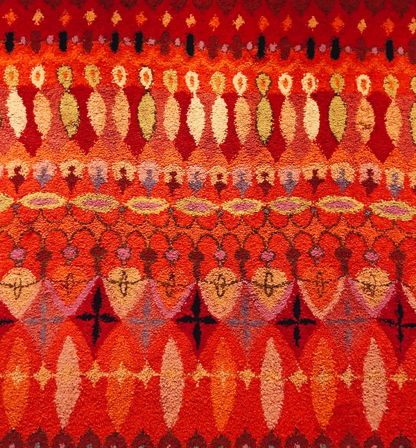
Moving on, Cynthia Sargent came into Mexico’s art and design scene in the 1960s after moving away from New York with her husband and artistic collaborator Wendell Riggs. Creating rugs with colorful, flowing, asymmetrical motifs, Sargent aimed to elevate tried and tested Mexican design practices, even contributing some pieces to Porset’s Art In Daily Life. Known also for her business savvy, Sargent founded the Bazaar Sábado in 1960, a weekend place of commerce still in operation, showcasing the works of artists of many places of origin. Sargent and Riggs also worked together to form the eponymous Riggs-Sargent, a company that created scalable lines of fabrics favored among the Mexican elite. As may be obvious in her work, Sargent’s asymmetrical motifs often evoke musical rhythms and were even given titles which referenced the names of famous European composers, a move that helped her gain favor with clients who considered themselves to be worldly.  

image
Colorful and asymmetrical motifs on Cynthia Sargent’s rugs, on display at the Art Institute of Chicago.

The show also featured the works of Sheila Hicks, another notable name in Mexico’s mid-century scene. Feeling a connection to Mexico’s strong lineage of weaving, Hicks sought to deconstruct her own pieces to reveal the many parts and individual threads, often pulling apart the threads at the center of each work to allow light to pass through. “Any good weaver would look at this and say, I don’t think this lady knows how to weave,” she said. In Hicks’s works then, it is the means rather than the end—the act of weaving rather than the product woven—that is central to the work. 

Anni Albers, meanwhile, was a student of the revered Bauhaus, now synonymous with functional modernism, visual restraint, and abstraction. Having fled to the United States in 1933, Anni and her husband Josef Albers began teaching at Black Mountain College in North Carolina where she met Porset. Having grown fond of Mexico through Porset, the Alberses visited Mexico several times throughout the 1960s, contributing much to its abstract modern design scene. Notably, Albers realized that the abstract forms and patterns that she adored and created had existed well before her time in Indigenous Mexican and American weaving. Inspired by this history, Albers sought to combine the modern with the ancient in her designs, which were eventually mass produced and sold by Knoll throughout the 1970s. 

Last but surely not least is Lola Álvarez Bravo, whose work stands out even among this distinguished group for both its medium and its message. Álvarez was a modernist in every conceivable meaning of the word: Working in photography throughout the 1950s, Álvarez sought to capture the energy and potential for modernization through photographs depicting Mexico’s industrialization. By collaging separate photographs into photomontages, Álvarez projected her socialist ideals while celebrating both the practical need for industrial modernization and the cultural need to retain Mexico’s longstanding and rich traditional modes of production.  

Alvarez’s work is not only interesting in its expression of socialist and modernist Mexican thought, but also in its placement within the exhibition as a whole. The first thing one sees upon entering the double doors of the gallery is a floor-to-ceiling photomontage in landscape format, depicting industrialists hard at work in the 1950s. These photomontages permeate the entire gallery, constantly contextualizing the work of each artist within the practical concerns of the time of their production, beautifully and thoughtfully synthesizing the idea of industry and production as art. 

It is frankly remarkable to find that only one of the six artists on display was actually born in Mexico. The fact that five modernists between 1940 and 1970 fell so deeply in love with Mexico, its traditions, and their potential for modernist applications serves to highlight the injustice of marginalizing Mexico’s indelible impact on design during this period. Though long overdue, it is a step in the right direction to highlight the culturally and geographically specific contributions of these artists to the greater conversation of what it meant to be modern in 20th-century Mexico. 

In a Cloud, in a Wall, in a Chair: Six Modernists in Mexico at Midcentury is on view until January 12, 2020 in the Modern Wing. 

Tagged : / / / / /