PHX Gallery, Where Exception Becomes Convention

PHX Gallery is a must-see for people whose love of Comme des Garçons reaches deeper than PLAY T-shirts and Converse collaborations.

Established in 2014 by Joachim and Carly Lapotre, PHX Gallery undoubtedly stands as one of Chicago’s best kept secrets, and is a must-see for people whose love of Comme des Garçons reaches deeper than PLAY T-shirts and Converse collaborations. Located in Chicago’s River North neighborhood, the gallery sits inside an unpretentious—yet clean and airy—warehouse, which is also home to other small galleries and studios. 

An unassuming set of glass double doors, framed with crown molding and a set of Venetian blinds, diligently protected the gallery from prying eyes. Image: PHX Gallery

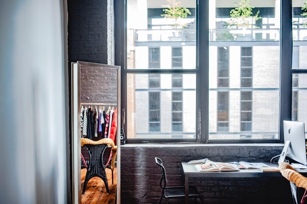
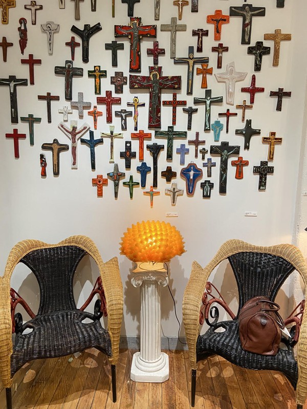
A warm, intelligent, and funny Parisian, Joachim led me to an unassuming set of glass double doors, framed with crown molding and a set of venetian blinds that diligently protected the gallery from prying eyes. The moment Joachim opened the door, I was immediately immersed into a world where fringe fashion and furniture are the rule, not the exception. A small, intimate space looking out onto the street and the building across the way, the room is the perfect setting in which to learn about Comme des Garçons and post-modernist furniture. Immediately to the left of the doors, a set of Prorok rattan armchairs by Borek Sipek for Driade from the late 1980s nestled protectively around a glowing and tactile yellow foam lamp by Masayo Ave for Antonangeli Illuminazione from the 1990s, which itself was perched upon a miniature white ionic column. In one of the chairs rested a sophisticated leather Boston bag from Comme des Garçons, and this entire scene was backdropped by mid-century ceramic wall crucifixes from Belgium. 

image
The feeling and visual gravity of the curious sheer black linen dress by Watanabe for Comme des Garçons from 2014, alternating from mesh to faux leather circles placed seemingly at random, were incredible. Image: PHX Gallery

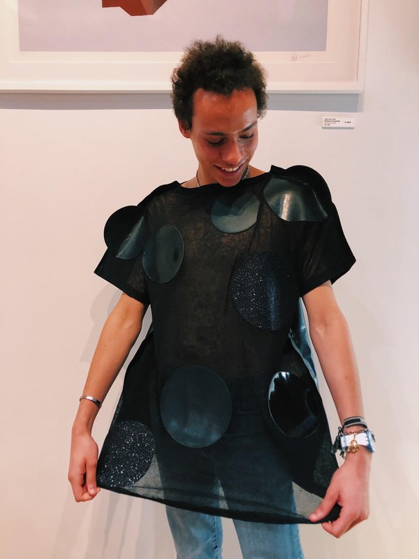
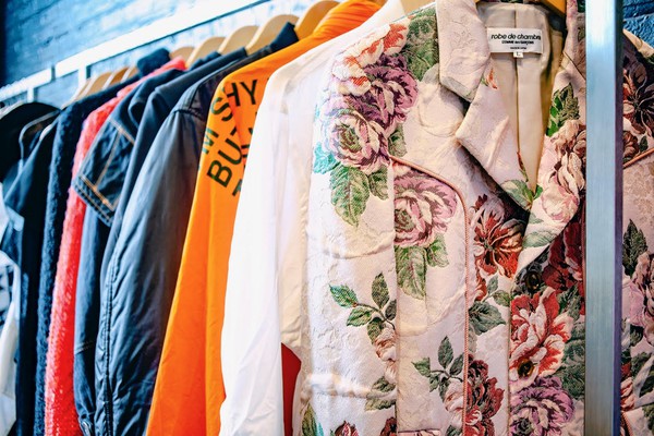
After I took in this magnificent scene, Joachim walked me through the multiple racks of vintage Comme des Garçons clothing, which encapsulate almost 40 years of Japanese avant-garde design from Rei Kawakubo and perhaps her most famous disciple and collaborator, Junya Watanabe. Describing the myriad of ways in which Kawakubo subtly (and not so subtly) defies conventional ideas of gender, form, and design, Joachim’s passion shone brightly and enveloped me further in the fantastic world of Comme des Garçons. Stopping at one particular piece, a curious sheer black linen dress by Watanabe for Comme des Garçons from 2014, Joachim encouraged me to try it on, an invitation I accepted without hesitation. The feeling and visual gravity of the garment, alternating from mesh to faux leather circles placed seemingly at random, were incredible.  

image
The feeling and visual gravity of the curious sheer black linen dress by Watanabe for Comme des Garçons from 2014, alternating from mesh to faux leather circles placed seemingly at random, were incredible. Image: PHX Gallery

Another standout that highlighted Kawakubo and Watanabe’s interest in creating seemingly ordinary clothes  was an asymmetric “hooded shirt” from 2011. What seemed from the front to be an ordinary button-down shirt, revealed itself upon closer inspection to be a hoodie, with orange stripes on the front and a red polka dot pattern on the back. Conversation about avant-garde Japanese clothing could have lasted forever, but we eventually began discussing the equally impressive collection of furniture and objets d’art placed throughout the room.

image
I was immediately immersed into a world where fringe fashion and furniture are the rule, not the exception. Image: PHX Gallery

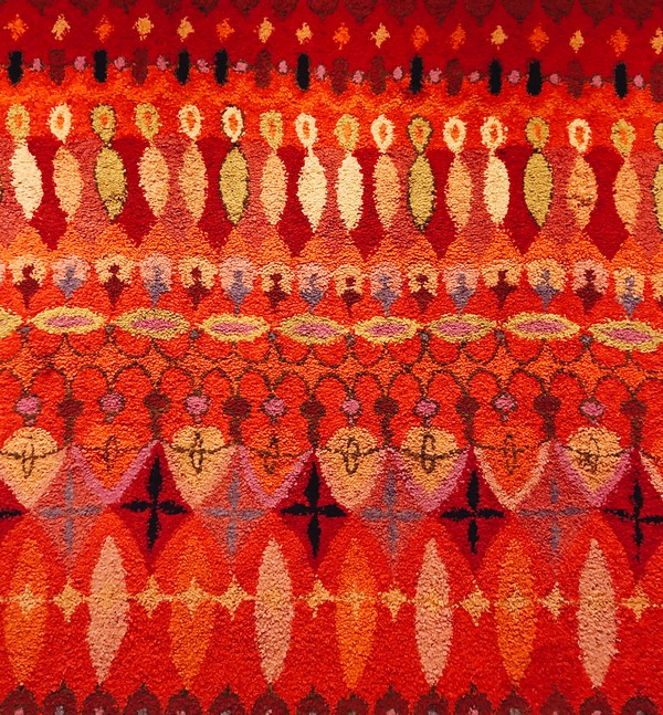
After being introduced to Memphis Group, Ettore Sottsass, and the postmodernist furniture movement through a 2018 show in New York’s chic SoHo district titled Raquel’s Dream House (curated by Raquel Cayre, who runs the fabulous Instagram account @ettoresottsass), I became a veritable fan of postmodernist furniture and objects. To that end, Joachim and I eagerly discussed Memphis Group legends such as the Super Lamp by Martine Bedin and the Carlton bookcase designed by Sottsass himself, all the while immersed in a constellation of post-modernist creations including the Shiva Vase Prototype from 1973 (which you have to see to believe), several Keith Haring rugs, and a few curious glass and ceramic vases, which were in turn interspersed between a collection of prints by Memphis veteran Nathalie Du Pasquier. A particular highlight of this unparalleled collection was the selection of lighting: a Divan 2 Pendant by Simon Henningsen for Lyfa hung in one corner, casting striking shadows upon the white walls, while a Murano Glass Lamp by Angelo Mangiarotti for Pollux Skipper rested on the floor, creating oblong rings of warm, yellow light across the wooden boards. A designer in his own right, Joachim revealed to me several of his own designs, ranging from delicate, glass blown vases to large, geometric, ceramic sake pitchers.  

From a visitor’s perspective, perhaps the greatest joy of PHX Gallery is that most things are for sale. After scheduling an appointment to browse all that’s on offer, guests can join the list of PHX’s clients in purchasing rare and covetable pieces of design history. In fact, it seems that the only person in the gallery who cannot take pieces home is Joachim himself, who declared with admirable restraint: “Curators cannot be collectors.” 

image
Seemingly ordinary clothes take on a more astonishing significance upon closer inspections. Image: PHX Gallery
Tagged : / / / / /

Richard Mille To Open a Boutique in Chicago

657CABB6-EA1C-44E7-99D2-B02EE898F8BC.JPG

Strolling along the world famous Oak Street in Chicago’s Near North Side, one passes the storefronts of legendary labels such as Moncler, Van Cleef & Arpels, Graff, Harry Winston, and Chanel. Historically, an Oak Street address has been a marker of success for jewelers and watchmakers, and it appears that the avant-garde watchmaker Richard Mille intends to keep this tradition with its imminent opening set to occur at 109 East Oak Street. This location will be RM’s sixth in the United States, as currently only Geneva Seal on Oak Street is authorized to sell Richard Mille products, and will further efforts toward solidifying Chicago as a city with an entrenched watch scene. Having little more to go on than a temporary shroud over the storefront announcing its future presence adjacent to Razny Jewelers, perhaps a proper introduction to Richard Mille is in order for Chicagoans.

First and foremost, Richard Mille is known for its aesthetically and materially revolutionary timepieces inspired by and used in Formula 1. In fact, the brand’s founder, Richard Mille, introduced his first timepiece in 2001 after leaving Mauboussin citing creative constraints. In the late 1990s and early 2000s, a particular sect of people in watchmaking became discontent with the constant production of watches that were advanced technologically, but all more or less resembled one another. Founded in 1991, it was really Franck Muller who broke the glass ceiling and, with strong sales and famous clientele, proved to the watchmaking world that expensive watches need not necessarily also be serious watches. Owing much to Franck Muller but naturally taking watchmaking to the next level, Richard Mille has from its beginnings been a brand inspired by Formula 1, and this is reflected in everything the brand does, from the naming schemes of its pieces, to sponsoring F1 teams and drivers, and even in its advertisements, where Richard Mille refers to its products as “A racing machine on the wrist”. As pertains to advertising, Richard Mille is famous for gracing the wrists of celebrities from many different spheres, including Margot Robbie, Felipe Massa, Rafael Nadal, Romain Grosjean, Bubba Watson, and Pharrell Williams, with Watson and Pharrell lending their names to special edition RM’s.

Formula 1 Driver for Ferrari, Charles Leclerc is partnered with Richard Mille. Image via

At this point, it’s important to address the elephant in the room, and that’s the astronomical price tags attached to any Richard Mille product, price tags which are especially difficult to justify considering that RM is such a young brand. Though any piece serves as a fine example, it seems that the public has been especially shocked by Richard Mille’s sapphire pieces, or pieces like the RM 19-02, an artistic watch which houses a tourbillon complication inside of a flower bud, the bud opening to reveal the complication at the push of a button. The sapphire pieces regularly retail for over $1.5 million U.S. dollars, while the RM 19-02 is not far behind at $1.1 million U.S. Though many would say that there is no explanation for such eye-watering prices, Richard Mille, a company at which each piece is produced through a revolutionary process, with revolutionary materials, and in small quantities, the costs of production are obscenely high. Each sapphire watch RM produces, for example, is machined from a single block of sapphire, taking more than 1,000 hours for the piece to go from raw stone to watch case. Not only is it incredibly difficult and expensive to source such a large piece of sapphire, but the machinery necessary for transforming raw sapphire into a watch case is in itself rather costly. Adding to this the fact that Richard Mille insists on manufacturing unique components, down to the screws, for nearly all of its products, the high cost of entry into this brand is more understandable.

The RM 56-02, a Sapphire Richard Mille.  Image  Via
The RM 56-02, a Sapphire Richard Mille. Image via

All of this to say, regardless of one’s opinions on how much is too much to pay for an object essentially meant to tell time, Chicago’s watch scene has much to gain from the opening of this legendary, cutting edge marque. Though no official details have been released concerning the date at which the boutique will be opened, it is safe to say that I remain anxious for the not-too-distant day when the racing machine comes to Oak Street.

The RM 07-02, a Sapphire Lady’s watch that gained infamy for its $1 million+ price tag.  Image  Via
The RM 07-02, a Sapphire Lady’s watch that gained infamy for its $1 million+ price tag. Image via

Featured Image via

Tagged : / / / / /

The Bauhaus Movement’s Complicated Chicago Story

The Art Institute’s centenary exhibit on the Bauhaus provides a refreshingly critical retrospective on the movement’s complicated relationship with Chicago.

Petal Occasional Table by Richard Shultz for Knoll Associates

When Nazi Germany forced the Bauhaus school of design in Weimar, Germany to permanently close its doors in 1933, many of its members felt that their revolutionary work in design was unfinished. Resolved to continue the work begun by the Bauhaus and its famed professors, such as Wassily Kandinsky and Walter Gropius, a group of instructors took root in the United States, taking particular interest in Chicago and the American Midwest. Among these transplants were Ludwig Mies van der Rohe and László Moholy-Nagy, who were both invited to teach at the New Bauhaus, now the Institute of Design (ID) at the Illinois Institute of Technology (ITT). Beginning in the mid-1930s, Moholy-Nagy and Mies created a modernist legacy in architecture and the arts with the help of their pupils and contemporaries. Their influence is still deeply felt in Chicago to this day.

 Because the media has extensively covered superstar figures such as Moholy-Nagy and Mies, it is quite refreshing to see an exhibition focused largely on the works of their previously anonymous students, emerging a century after the founding of the original Bauhaus. Importantly, many of the lessons taught at both the original Bauhaus and its American schools dealt with the qualities and characteristics of individual materials, favoring intimate interaction with objects and great design over formal artistic or architectural training. As such, many of the pieces on display in the small but densely populated space at the Art Institute are vaguely architectural but maintain a deeper focus on the simple form and materiality of everyday objects within the industrial context of the 20th century. This philosophy is readily apparent in works such as Institute of Design Foundation Course Wire Exercise, in which a delicate wire-framed sculpture vaguely references industrial hallmarks, like skyscrapers and metalworking. Similarly, Hall of Sport and Culture, Collage, dated from the early 1970s, features a football player, a pair of dancers, and a crowd set within the context of what appears to be a sort of building, itself resting on color blocks. In fact, the work was equally inspired by a building in Detroit as it was by modern art, film, and the emerging technique of collage.

The exhibit also seeks to correct for the historical lack of recognition of the many women who studied in the Chicago Bauhaus schools. One such figure who is featured prominently is Dori Altschuler, whose work during her time at the ID recently received recognition from several national publications, as well as from the journal Arts & Architecture in 1952. Altschuler’s use of recycled shopping bag materials to make architectural sculptures is particularly interesting within the contemporary context of natural resource conservation, as it seems that she—and the Bauhaus movement in general—was well ahead of her contemporaries in understanding the existential threat that urbanism and modernization posed on the planet’s natural resources.

image
Flexible Interlocking Structures, Dori (Hahn) Altschuler

Despite their innumerable contributions to design, architecture, and art, the Bauhaus’s insistence on unified, homogenous urban spaces master-planned by privileged Europeans and Americans allowed for the creation of troubling projects, notably on Chicago’s South Side. Enacting a plan that eerily recalls Georges-Eugène Haussmann’s classist transformation of Paris during the 19th century, Mies and IIT demolished large tracts of land on the South Side, displacing large populations of low-income Black families and businesses under the guise of “urban renewal.” The effects of this process are still glaringly obvious today, when the de facto segregation of wealthy, white Chicagoans and low-income Black Chicagoans remains an unsolved issue. Standing almost as an allegorical testament to this shameful period, Mies van der Rohe’s School of Social Service Administration, completed in 1965 for the University of Chicago, sits prominently along 60th Street, which has long represented the border between the vast property of the University and its wealthy inhabitants, and the Woodlawn community occupied primarily by low-income residents of color.

Viewing the contributions and controversies of the Chicago Bauhaus era in equal proportion, Bauhaus in Chicago: Design in the City presents perhaps the most comprehensive and most progressive retrospective on the movement. On view through April 26, 2020 in Gallery 283 of the modern wing, this show is not one to miss.

Tagged : / / / / /

Bringing Mexican Mid-century Modernism to the Fore

Ruth Asawa's famous looped-wire sculptures, currently on display at the Art Institute of Chicago.
Ruth Asawa’s famous looped-wire sculptures, currently on display at the Art Institute of Chicago.

For those not well-versed in the history of design, midcentury modernism carries associations with places like Germany, Sweden, and Southern California, but the link between modernism and Mexico is less obvious. The Art Institute of Chicago’s exhibition In a Cloud, in a Wall, in a Chair: Six Modernists in Mexico at Midcenturyseeks to change that. By showcasing the works of six artists (Clara Porset, Ruth Asawa, Cynthia Sargent, Sheila Hicks, Anni Albers, and Lola Álvarez Bravo) who lived or worked in Mexico between 1940 and 1970, this exhibition encourages conversation around Mexico’s contributions to modernism by locating the commonalities between these artists. 

The exhibition takes its name from a quote by Clara Porset, who immigrated to Mexico in 1935 as an exile from Cuba. During her 1952 exhibition, Art In Daily Life, Porset declared, “There is design in everything…in a cloud, in a wall, in a chair, in the sea, in the sand, in a pot.” Along with the other artists on display, Porset was working at a crucial time in Mexico’s design history, a time when the Mexican government was working to establish a recognizable and cohesive design identity.  

Combining traditional Mexican craft methods with newer, technologically driven techniques, Porset took her vision to the public, using furniture to express the daily lives of Mexicans. Porset’s Lounge Chair, for example, was conceived in the 1950s and was used for decades at Acapulco’s famed Pierre Mundo Imperial hotel. One of Porset’s most famous works, the Butaque Chair, infused new life into a traditional Latin American design by incorporating materials such as plant fibers and leather which made the chair suited to Mexico’s different climates. In line with the modernist ideals of the time, Porset also worked to ensure that her versions of the Butaque Chair were mass-producible and affordable. 

image
Clara Porset’s Butaque chair, on display at the Art Institute of Chicago.

In contrast to Porset, the works of Ruth Asawa were not primarily functional, but rather overtly sculptural. Like several of the other artists exhibited at the Art Institute, Asawa spent her formative years at Black Mountain College in North Carolina, where she initially began exploring looped wire as a means of creating minimalistic, organic forms. It was only after her move to Mexico that Asawa learned her defining crochet loop technique, initially employed for the creation of egg baskets, but later used to produce wire sculptures. Reminiscent of the movement of water or even a spider’s web, these looped-wire sculptures can be seen hanging from the ceilings of many museums and public spaces, notably the new Whitney Museum in New York. 

Moving on, Cynthia Sargent came into Mexico’s art and design scene in the 1960s after moving away from New York with her husband and artistic collaborator Wendell Riggs. Creating rugs with colorful, flowing, asymmetrical motifs, Sargent aimed to elevate tried and tested Mexican design practices, even contributing some pieces to Porset’s Art In Daily Life. Known also for her business savvy, Sargent founded the Bazaar Sábado in 1960, a weekend place of commerce still in operation, showcasing the works of artists of many places of origin. Sargent and Riggs also worked together to form the eponymous Riggs-Sargent, a company that created scalable lines of fabrics favored among the Mexican elite. As may be obvious in her work, Sargent’s asymmetrical motifs often evoke musical rhythms and were even given titles which referenced the names of famous European composers, a move that helped her gain favor with clients who considered themselves to be worldly.  

image
Colorful and asymmetrical motifs on Cynthia Sargent’s rugs, on display at the Art Institute of Chicago.

The show also featured the works of Sheila Hicks, another notable name in Mexico’s mid-century scene. Feeling a connection to Mexico’s strong lineage of weaving, Hicks sought to deconstruct her own pieces to reveal the many parts and individual threads, often pulling apart the threads at the center of each work to allow light to pass through. “Any good weaver would look at this and say, I don’t think this lady knows how to weave,” she said. In Hicks’s works then, it is the means rather than the end—the act of weaving rather than the product woven—that is central to the work. 

Anni Albers, meanwhile, was a student of the revered Bauhaus, now synonymous with functional modernism, visual restraint, and abstraction. Having fled to the United States in 1933, Anni and her husband Josef Albers began teaching at Black Mountain College in North Carolina where she met Porset. Having grown fond of Mexico through Porset, the Alberses visited Mexico several times throughout the 1960s, contributing much to its abstract modern design scene. Notably, Albers realized that the abstract forms and patterns that she adored and created had existed well before her time in Indigenous Mexican and American weaving. Inspired by this history, Albers sought to combine the modern with the ancient in her designs, which were eventually mass produced and sold by Knoll throughout the 1970s. 

Last but surely not least is Lola Álvarez Bravo, whose work stands out even among this distinguished group for both its medium and its message. Álvarez was a modernist in every conceivable meaning of the word: Working in photography throughout the 1950s, Álvarez sought to capture the energy and potential for modernization through photographs depicting Mexico’s industrialization. By collaging separate photographs into photomontages, Álvarez projected her socialist ideals while celebrating both the practical need for industrial modernization and the cultural need to retain Mexico’s longstanding and rich traditional modes of production.  

Alvarez’s work is not only interesting in its expression of socialist and modernist Mexican thought, but also in its placement within the exhibition as a whole. The first thing one sees upon entering the double doors of the gallery is a floor-to-ceiling photomontage in landscape format, depicting industrialists hard at work in the 1950s. These photomontages permeate the entire gallery, constantly contextualizing the work of each artist within the practical concerns of the time of their production, beautifully and thoughtfully synthesizing the idea of industry and production as art. 

It is frankly remarkable to find that only one of the six artists on display was actually born in Mexico. The fact that five modernists between 1940 and 1970 fell so deeply in love with Mexico, its traditions, and their potential for modernist applications serves to highlight the injustice of marginalizing Mexico’s indelible impact on design during this period. Though long overdue, it is a step in the right direction to highlight the culturally and geographically specific contributions of these artists to the greater conversation of what it meant to be modern in 20th-century Mexico. 

In a Cloud, in a Wall, in a Chair: Six Modernists in Mexico at Midcentury is on view until January 12, 2020 in the Modern Wing. 

Tagged : / / / / /

A Painful Goodbye To Barneys

At a cursory glance, it’s easy to dismiss the fate of Barneys New York as just another department store lost to the ruthless and unstoppable advance of online shopping and overnight shipping. Though many shoppers might liken Barneys to a number of other high end department stores like Saks Fifth Avenue, Neiman Marcus, or Bloomingdale’s, Barneys carried a heftier cultural importance, acting as a hub to connect celebrities, aspiring designers, and creative minds alike. It is with the golden era of Barneys New York in mind that we honor it with this swan song.

Barney Pressman in front of his first store, Image  Via
Barney Pressman in front of his first store. Image via

Opened in 1923 as a designer label discount store for men at the intersection of 7th Avenue and 17 Street in Manhattan, Barneys, named after its founder Barney Pressman, grew rapidly and eventually opened a women’s department in the 1970s. In 1993, Barneys once again created waves in the high-end department store scene with the opening of their then-new 230,000 square foot flagship location on Madison Avenue in Manhattan, but the news wasn’t all good. Just after the opening of the new flagship store, customers and window shoppers began complaining about an atmosphere of prideful exclusion and unattainability which was reflective of Barneys tone deaf approach to luxurious living at this time. Unsurprisingly, Barneys’ inability to reflect the values and desires of its customers led the brand into its first bankruptcy filing in 1995, resulting in significant downsizing and the closure of two stores in Texas and one in Michigan. Though Barneys began to rebuild itself in its former image after coming back from the brink of extinction for the first time, the store was placed under new management in 2010, management which amplified the commercial aspects of the business without also elevating Barneys defining quirky qualities. After 9 more years of alienating themselves from consumers and those who loved Barneys as one of New York’s most important cultural icons, Barneys New York filed for Chapter 11 bankruptcy for the final time, in August of this year, citing, amongst other causes, unreasonable rent and low foot traffic. But despite the unfortunate ending of Barneys New York, there is much to celebrate about the storied luxury titan.

Perhaps its greatest contribution to fashion, Barneys New York consistently gave a voice and a platform to unique, emerging young designers and had a pivotal role in launching the careers of people like Giorgio Armani and Rick Owens. In fact, throughout most of its glorious history, Barneys defined New York fashion more than any other department store. After all, it was Simon Doonan, brought onboard in 1986, who designed Barneys’ now iconic window displays, elevating the craft to the art sphere, and injected the store’s spaces with whimsical, and sometimes outright comical, displays and curated items. Barneys, and Neiman Marcus to a lesser degree, has always been a place where one could shop from storied and established fashion houses whilst at the same time discovering new and daring brands. It was, in part, this atmosphere of the unexpected and perpetually exciting that made Barneys a social hub for celebrities and socialites the world over. Barneys was as much a destination for shopping as it was a destination for making new friends and meeting old ones, and this simply doesn’t ring true with the other noteworthy players in this space such as Neiman Marcus, Bloomingdales, and Saks Fifth Avenue. All of these stores, which have succeeded in fulfilling the basic functions of selling luxury clothing on a large scale, have failed to create a brand identity as strong as Barneys. 

Simon Doonan, Creative Director to Barneys New York with monogrammed Goyard trunk. Image  Via
Simon Doonan, Creative Director to Barneys New York with monogrammed Goyard trunk. Image via
A window display at Barneys New York. Image  Via
A window display at Barneys New York. Image via

So, having been bought by Authentic Brands Group and B. Riley at a cost of over $271 million, Barneys inventory is currently being liquidated at all of its open locations. In recent weeks, people have inundated store in droves to take it all in one last time, doing everything in their power to remember the sights, sounds, and smells of one of the most culturally impactful stores in New York. The spirit of Barneys will always live on, especially as so many now established brands have the store to thank in part for their success, but also because of the many passionate fans who refuse to let the memory of Barneys fade. If you find this news painful as I do, I suggest following @thespiritofbarneys on instagram, or visiting Saks Fifth Avenue who apparently secured the rights to the Barneys name and may have plans to open mini-Barneys’ inside several locations. One thing is certain—Chicago’s Oak Street, home to our local Barneys location, will never be the same.

Paris Hilton arriving at Barneys Los Angeles location. Image  Via
Paris Hilton arriving at Barneys Los Angeles location. Image via

Featured image via

Tagged : / / / /

Drink to Health

The Pret A Manger Green Good Stuff juice, despite its uneven balance between fruits and vegetables, is a convenient grab when in a rush.

A few weeks ago, I began posting rather subjective “juice reviews” on my Instagram Stories, where I would rather briefly elucidate the qualities of the juice I drank that day and compare it to other juices from Hyde Park. I was rather surprised to find that people actually cared about these reviews and wanted to hear more, so naturally I jumped at the chance to expound upon my thoughts in The Maroon

To begin, I’ll run through the criteria by which I judged each of the five juices on this list, and then I’ll rank each juice from worst to best. For me, the criterion of utmost importance when ranking a juice is the ratio of vegetables to fruit. Juices which favor vegetables to fruit are not only healthier, since they contain less sugar, but are also a better value proposition if you consider the nutrients, rather than its flavor. My second metric is price, and the final one for ranking these juices is taste. Because “good tasting” juices often have a lot of apples or bananas, I choose to take aspects which make a juice more nutritious into more serious consideration. 

Fifth Place: Naked Boosted Green Machine Juice Smoothie

image
Astoundingly sugary, overpriced, and falsely marketed, NakedBoosted Green Machine Juice Smoothie sits rightfully at the bottom of this tier list.

Let the record show that this juice is being reviewed only as a point of comparison for the four other juices in this piece. Contrary to common belief, this drink is not healthy. With an ingredient list that favors fruit and fruit derivatives, this juice mainly satisfies flavor requirements instead of nutritional ones. For instance, this juice contains 28 grams of sugar—more sugar than many doctors recommend should be consumed daily. Additionally, the ingredient list includes “natural flavors,” a vague term companies use to disguise the inclusion of preservatives and other unnecessary ingredients. This juice receives a 3/10 because it satisfies the desire for a good-tasting juice, but fails to be nutritious and costs $7.30. 

Fourth Place: B’Gabs Goodies Mighty Green Smoothie

Though this option isn’t technically a juice, I chose to include it because B’Gabs is close to campus, and the smoothie itself is a great value proposition. B’Gabs does have pressed juices, though not any which contain the ingredients I often look for in a juice. The Mighty Green smoothie constitutes of greens, avocado, zucchini, parsley, green apple, and banana. Though I don’t know what exactly constitutes the “greens,” the smoothie does have a faint taste of dark green vegetables. Additionally, because this option is a smoothie and not a juice, one can add ingredients like avocado and banana. Thirty-two ounces of Mighty Green costs $10, which makes this juice the best value proposition out of any on this list. It’s also worth mentioning that B’Gabs Goodies is a fully vegan restaurant, so you can treat yourself to a snack while waiting on your smoothie. Because of the value of this juice and its fairly robust ingredient list, it receives a 6/10. 

Third Place: Pret A Manger Green Good Stuff

For University of Chicago students, this juice is already preferable to others on this list because it can be bought in Reynolds Club with Maroon Dollars when you’re in a rush to get to class. Green Good Stuff has a small and relatively clean ingredient list, with apple, cucumber, spinach, celery, and lime, although there is a large imbalance between vegetables and fruits. Because of this, Green Good Stuff has a startling 33 grams of natural sugar, which is five grams more sugar than the Naked Juice which landed at the bottom of the list because of its sugar content. So why does this juice make it to third place? Because of the convenience of this juice (located in Reynolds Club), its fair price of $6.49, and its transparent ingredient list, this juice outshines Naked’s offering and scores a 7/10. 

Second Place: Bonne Sante Health Foods Get It Green Juice

If I had the time in my schedule to go to Bonne Sante Health Foods on 53rd Street every single afternoon to procure this juice, I would. The ingredients include kale, apple, cucumber, celery, parsley, lemon, spinach, and ginger, and the juice is offered in two sizes, though you may as well go with the larger 16-ounce bottle to save trips to the store. The ingredient list has a healthy balance between vegetables and fruits, and I especially love to see that both kale and spinach are included. Before tax, the 16-ounce bottle costs $11, which is certainly not a good deal compared to the Mighty Green smoothie. However, the fact that the former is a pressed juice and the latter a smoothie explains much of the cost difference. To sum it up, I place this juice near the top of the list at 8/10 because it has the most robust ingredient list, comes in a good portion, and is competitively priced amongst similar pressed juices of the same size.  

First Place: Joe & The Juice Green Tonic

image
Standing proudly at the top of the list, Joe & The Juice Green Tonic has a flavor that matches its ingredients, and its healthy blend proves to be a stellar option. Featuring a painting by Nik Chapleski.

This juice easily wins first place. Though it’s true that most Joe & The Juice locations are in the Loop and therefore terribly inconvenient for UChicago students to buy, the offerings contain really short ingredient lists (between three and 10 ingredients) and are reasonably priced between $5 and $12. The location I frequent is located at 980 North Michigan Avenue at the end of the Magnificent Mile, and my drink of choice is a menu item only offered at certain locations known as the Green Tonic. The Green Tonic consists of kale, celery, and cucumber, and this juice ranks the highest out of all those reviewed because it has two vegetable ingredients and only one fruit—and a particularly healthy one at that. It should be said, however, that the flavor of the juice accurately reflects the ingredient makeup, so if you value the sweetness of your green juices, this will probably not be a good option for you. Considering the price and ingredient list, the Green Tonic is the clear winner, and is accordingly ranked a 9/10. 

None of the juices on this list ultimately received a 10/10 because all of them are packaged in single-use plastic. My local juicery in New Jersey uses glass mason jars and takes a dollar off the price of a juice purchase for every glass bottle a customer returns. Considering that sustainability, specifically the ubiquity of single-use plastics, is a major issue here, the failure of these juices to be green in this sense of the word means no 10s were given today. 

Tagged : / / /