John Hughes Films and 80s Fashion

John Hughes Films and 80s Fashion

Miles Franklin

The last several months have been the most challenging and uncertain time many of us have ever faced. With record numbers of people losing jobs, students being forced to return home from school, and nearly all of us risking our health and that of others simply to make a run to the grocery store, there is much that appears bleak right now. As pertains to those of us who love to dress and are now stuck at home without a reason to carefully consider our garments every day, self-quarantining can feel like a creative block. Wishing to bring some inconsequential drama back into my life in lieu of the gossip my friends and I would regularly exchange in campus coffee shops, I turned to rewatching John Hughes cult classics like Ferris Bueller’s Day Off, The Breakfast Club, Pretty in Pink, and Sixteen Candles. While watching Ferris Bueller’s Day Off and Pretty in Pink in particular, I was surprised to find so much iconic mid-80s fashion on display, and in the spirit of staying at home while still remaining inspired by how people dress, I present the most fashionable characters in Ferris Bueller’s Day Off and Pretty in Pink.

1. Sloane Peterson
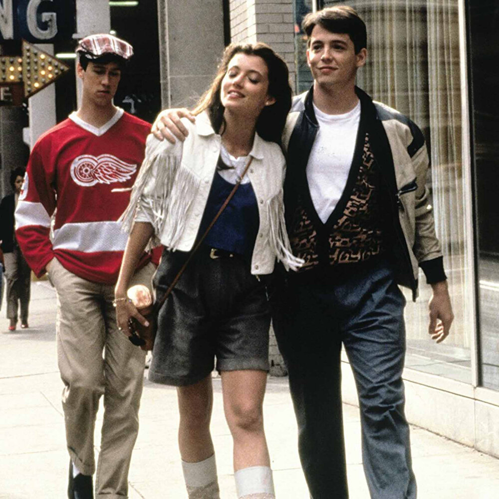
Sloane (Mia Sara) pictured with Ferris (Matthew Broderick) and Cameron (Alan Ruck). Image  Via
Sloane (Mia Sara) pictured with Ferris (Matthew Broderick) and Cameron (Alan Ruck). Image Via

Sloane Peterson, played by Mia Sara, was Ferris Bueller’s effortlessly gorgeous girlfriend. Throughout the movie, Sloane is seen wearing a white, cropped fringe jacket with gray above-the-knee shorts and beaded white boots to match the jacket. The cowgirl-meets-Los Angeles aesthetic is completed by Sloane’s light brown leather crossbody bag, and the Cartier Must de Cartier watch that sits on her wrist alongside a delicate bracelet. Combining this ensemble with the demeanor of the character that Sara plays ensured Sloane’s status as an 80s teen movie icon.

Sloane’s Cartier Must de Cartier watch. Image  Via
Sloane’s Cartier Must de Cartier watch. Image Via

2. Jeanie Bueller

Jeanie Bueller (Jennifer Grey) wearing her iconic black tote bag. Image  Via
Jeanie Bueller (Jennifer Grey) wearing her iconic black tote bag. Image Via

Jeanie Bueller’s contribution as a fashionable character in Ferris Bueller’s Day Off has less to do with her outfit per se, and more to do with her accessories, chief among them being her quirky, angular 80s car (which Ferris is quite jealous of) and her tote bag that she’s seen angrily lugging around throughout the film. Perhaps intentionally, Jeanie’s bag is featured quite prominently in many of her scenes; it’s a glossy black tote covered in large, distinctive patches which seem to be logos of some kind, and the bag itself sticks out particularly because of how dark it is in contrast to her bright pink sweater. Then, of course, there’s her car; a white, 1985 Pontiac Fiero which Jeanie is seen throwing around the road in several scenes, eventually skidding to a halt in the Bueller’s driveway towards the end of the film. Given Jeanie’s brooding and decidedly perturbed disposition, the bag and the car both seem to be more extensions of her personality rather than simply objects she uses.

Jeanie’s car parked in front of the Bueller’s quintessential suburbian home. Image  Via
Jeanie’s car parked in front of the Bueller’s quintessential suburbian home. Image Via

3. Katie Bueller

Katie Bueller (Cindy Pickett) epitomizing 80’s business casual. Image  Via
Katie Bueller (Cindy Pickett) epitomizing 80’s business casual. Image Via

As one of Ferris’ responsible and doting parents in Ferris Bueller’s Day Off, Katie Bueller is perhaps the most unexpected character from the film to make it into an article about 80s fashion in teen films, yet a closer look at her outfit reveals some interesting insights into business casual dressing in the 1980s. Pieces of her look that stand out include her shiny one piece necklace, gaudy earrings, and belt with an asymmetrical geometric buckle (sadly not pictured).

Moving on to Pretty in Pink, a movie which follows a few days in the high school experience of a girl who makes many of her own outfits, it is only fair that we first highlight the fashion prowess of the protagonist Andie Walsh, played perhaps unsurprisingly by Molly Ringwald (a staple in many John Hughes films).

4. Andie Walsh
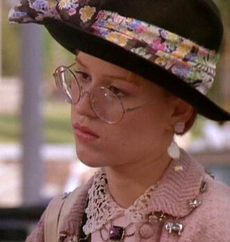
Andie Walsh (Molly Ringwald) in one of her well layered ensembles. Image  Via
Andie Walsh (Molly Ringwald) in one of her well layered ensembles. Image Via

Perhaps what is so compelling about Andie Walsh in Pretty in Pink is not her outfits themselves, but the fact that they had been handmade. The storyline of the movie prominently features scenes of classism and highlights the financial disparity between the students of Andie’s school in frequently shocking, if not terribly nuanced scenes, so Andie’s intricate handmade outfits not only serve to please aesthetically, but also to mock the de facto uniform of the wealthy students. As such, Andie’s outfits are often wonderfully layered and complementary to her sunny yet serious attitude, and the movie culminates in the unveiling of the pink (shocking!) dress she created to wear to the prom.
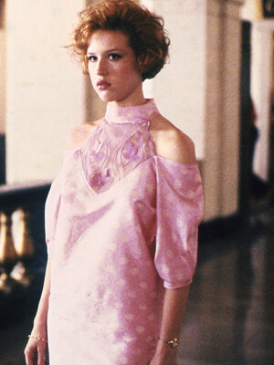
Andie’s triumphantly pink prom dress. Image  Via
Andie’s triumphantly pink prom dress. Image Via

5. Iona

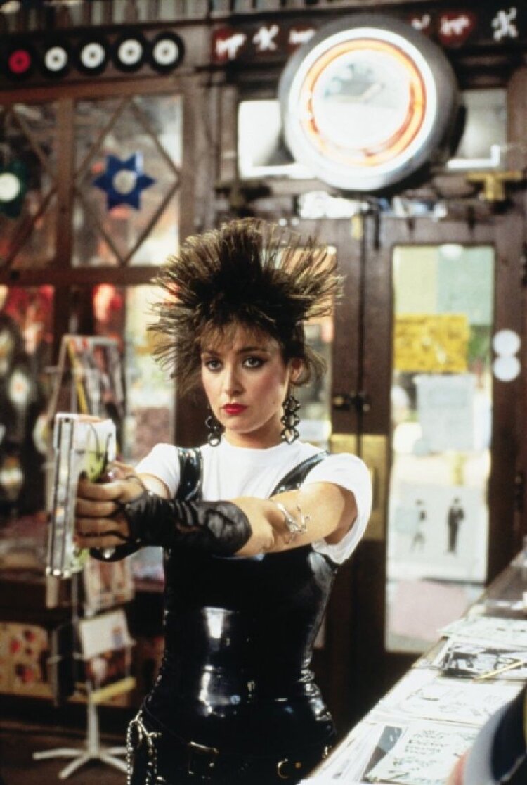
Iona (Annie Potts) shortly after assailing Duckie with staples. Image  Via
Iona (Annie Potts) shortly after assailing Duckie with staples. Image Via

Iona, the owner of the record store at which Andie works, so perfectly embodies the stereotypical outlandishness of the 80s club kid that her looks end up being unashamedly kitsch, moving wonderfully from one pole of eccentricity to the other. Throughout the course of the film, Iona presents a 50s version of herself (in a pink dress which is to become part of Andie’s pink dress), a version of herself who wears spiked hair and elbow length gloves, and a version of herself who wears white hair and would have looked perfectly at home in a scene from Beverly Hills Cop. 

6. Duckie Dale

Finally we arrive at Andie Walsh’s best friend and longtime admirer, Duckie Dale, who is so named in large part because of his duckbill-like white shoes. Duckie’s outfits largely play into his trademark goofiness, his shoes being case-in-point, and ensure that taking him seriously is an impossibility. Ultimately, though, there is still something admirable about the confidence he demonstrates through his wardrobe.
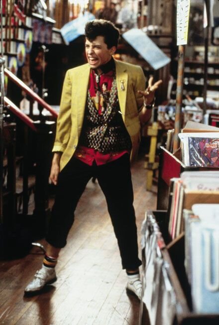
Duckie Dale (Jon Cryer) causing a scene. Image  Via
Duckie Dale (Jon Cryer) causing a scene. Image Via

Having made what I believe is far too long a list of fashionable characters from movies by a single director/screenwriter from a time in film that is long past, I hope I have, at the very least, added a few cult classics to your watch list. Now that we’re all stuck at home spending an inordinate amount of time in front of screens, rewatching our favorite films with an eye to how they may have influenced our styles is a whimsical but worthwhile endeavor at any time, but especially today.

Featured Gif via

Tagged : / / / / / / /

Five Thoughtful Designer Storefronts

Before my interest in fashion and handbags really took off, my main aesthetic concern was architecture. As my interest in fashion began to develop, I found myself making pilgrimages to the various physical locations of the designers whose work I most appreciated, and I was pleasantly surprised to find that many of them take great care to create sophisticated, often playful, facades for their stores. In an effort to exalt the connections between architecture and fashion, I am excited to share with you five thoughtful designer storefronts.

1. Hermès, Amsterdam

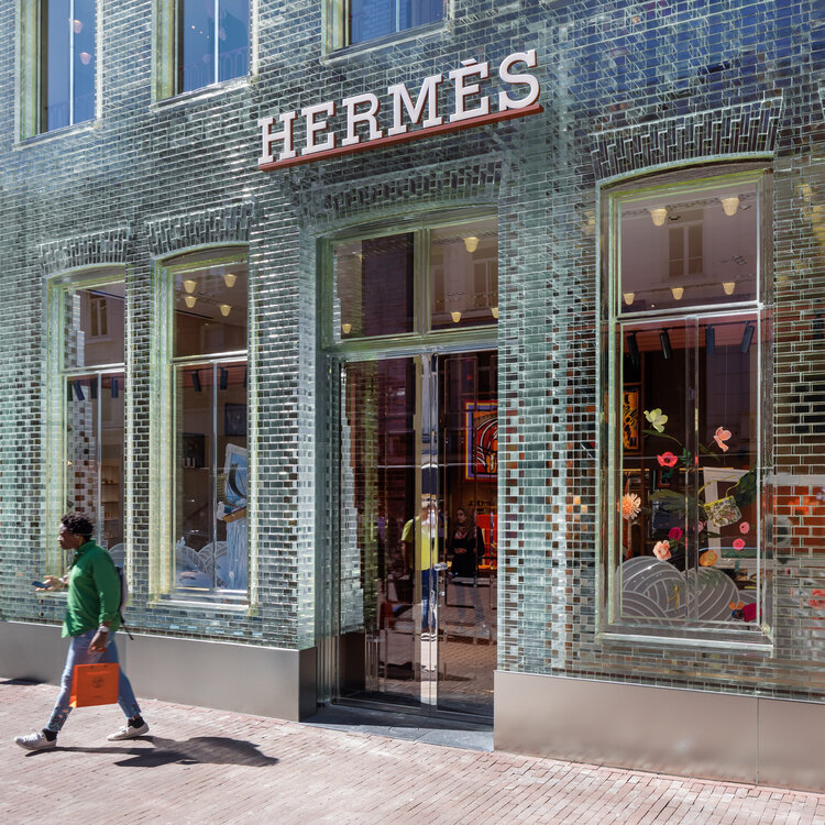
Customer leaves Hermès in Amsterdam with the coveted orange bag. Image  Via
Customer leaves Hermès in Amsterdam with the coveted orange bag. Image Via

Hermès made headlines in 2019 when, in Amsterdam, it opened a two-storey boutique in a building with a facade composed of glass bricks. Designed by MVRDV as a townhouse, and once occupied by Chanel, the glass facade of the store immediately fascinates passersby who can look through the wall and make out shapes and colors inside of the store. The structure known as Crystal Houses, which occupies a prominent plot on one of Amsterdam’s most well-known retail streets, seems to challenge both the architectural homogeneity of the street as well as Hermès’ own conservatism.


2. Dior Flagship, Paris

Pedestrians pass under the frosted limbs of Dior’s Christmas installation in Paris. Image  Via
Pedestrians pass under the frosted limbs of Dior’s Christmas installation in Paris. Image Via

Dior’s Paris flagship store, located on the Avenue Montaigne, is known for reinventing its facade with each passing season. Though every iteration of the store’s facade is worth talking about, Dior absolutely shattered expectations with it’s Christmas 2018/2019 installation; an elegantly proportioned, yet all-consuming white Christmas tree which glowed a warm yellow at night and shielded customers as they entered and exited the boutique. Though I’ve attached my favorite photo of the tree, I think it’s well worth your while to Google this one and browse further.

3. Louis Vuitton, New York and London

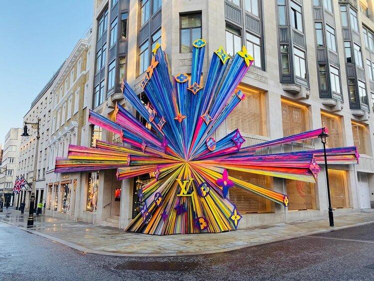
Three-dimensional Louis Vuitton monogram in London. Image  Via
Three-dimensional Louis Vuitton monogram in London. Image Via

Two storefronts well known for their constant reinvention are Louis Vuitton’s New York and London flagships. As with Dior, it is certainly true that every Louis Vuitton location adopts a universal, seasonally changing design language to keep each location recognizable and current. But while Dior makes its biggest statement in Paris, Louis Vuitton goes all out in Manhattan and London. Under the visual creative direction of Faye Mcleod (@fayedreamsaloton instagram), a new, colorful, three-dimensional explosive look was created for the LV monogram.

This new visual was painted onto the 10+ storey facade of Louis Vuitton’s Midtown Manhattan location, and was rendered in metal and attached to scaffolding at LV’s New Bond Street location in London for a genuinely three-dimensional experience. This 3D rainbow monogram motif was also installed in Louis Vuitton boutique windows across the world, taking the shape of hearts, orbs, and even a full size Christmas tree in LV’s Place Vendôme location in Paris.


4. Goyard, Monte Carlo

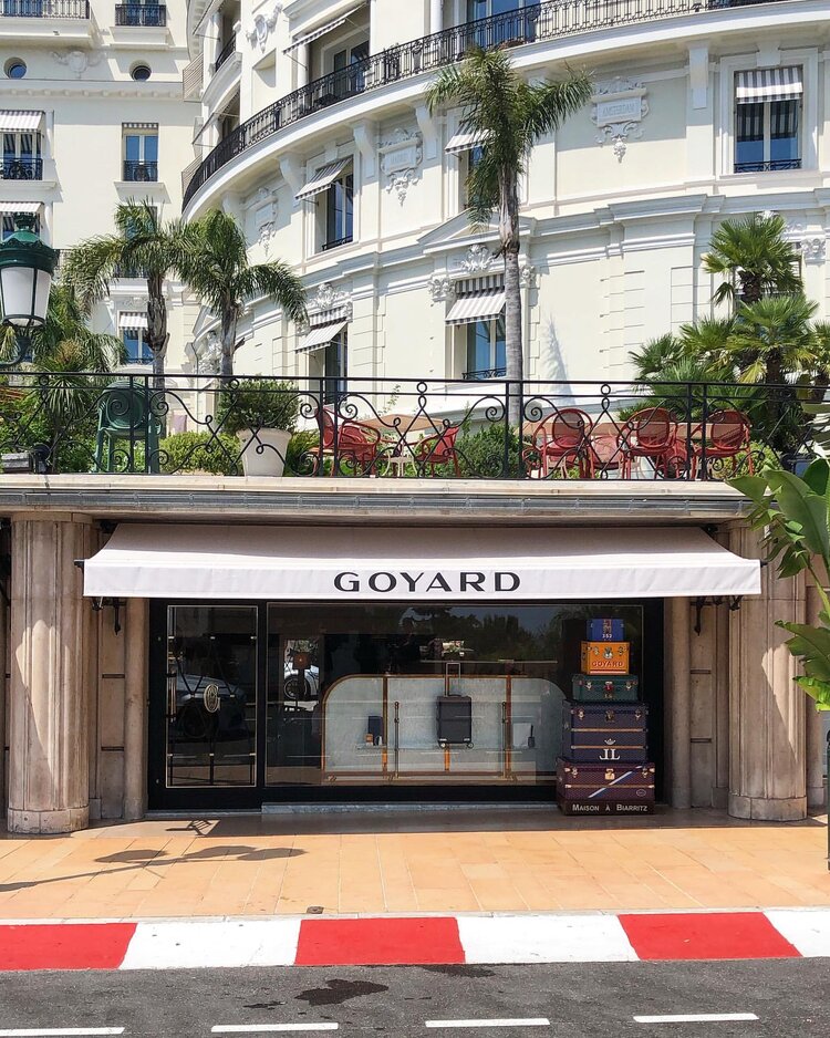
The facade of Goyard’s Monte-Carlo flagship, fronted immediately by the Monaco Grand Prix circuit. Image  Via
The facade of Goyard’s Monte-Carlo flagship, fronted immediately by the Monaco Grand Prix circuit. Image Via

Having had an intermittent presence in Monte-Carlo since the end of the 19th century, Maison Goyard has recently returned, opening up at an address along the city’s famed Avenue de Monte-Carlo. While I am appreciative of the storefront itself (a pared down, monochromatic single-storey glass and stone facade with immaculate white awnings printed with “GOYARD,” the whole store topped by a lush pedestrian walkway), the store’s location is much more interesting. As can be seen in the photograph, the store sits right along the famous route of the Formula 1 Monaco Grand Prix—perhaps the single most important circuit in Formula 1 since its inauguration by Prince Pierre in 1929. The physical situation of the store not only implicates it in the excitement of nearly a century of sporting history, but also ensures that the Goyard banners will be seen anytime filming occurs along the track.


5. Burberry, Chicago

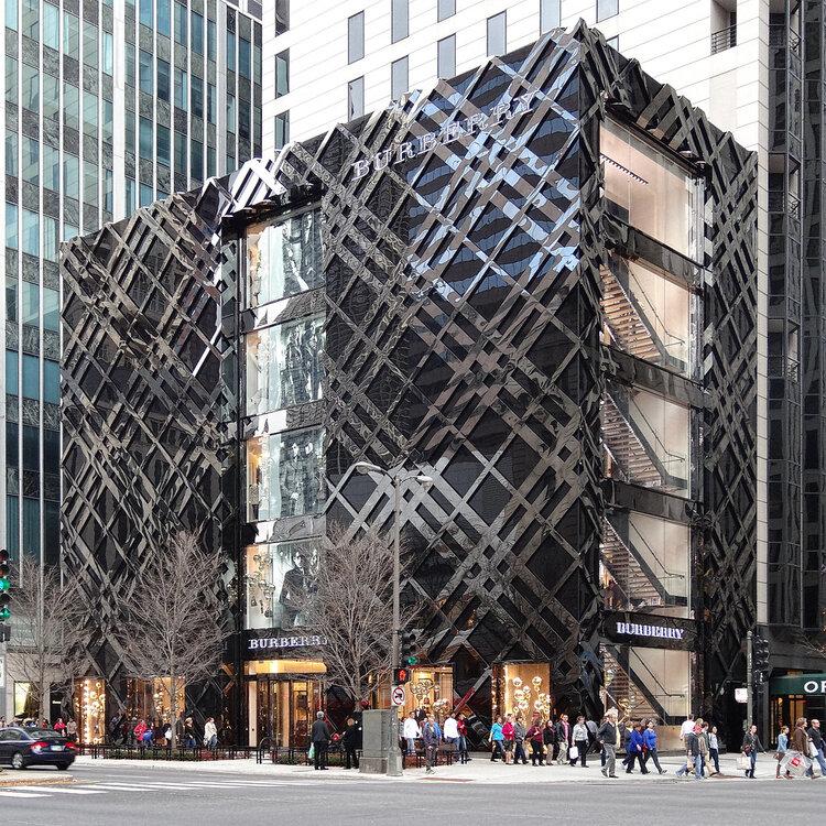
The Burberry storefront situated on Chicago’s famous Magnificent Mile. Image  Via
The Burberry storefront situated on Chicago’s famous Magnificent Mile. Image Via

Finally, as MODA is based in Chicago, I feel that it is only fair to include a storefront from our very own city. It may not come as a surprise to Chicagoans that I have selected Burberry on the Magnificent Mile. Positioned across from The Roastery, the largest Starbucks location in the world, is the glossy, midnight black Burberry boutique. At first glance, it appears to be simply a large and tall volume, cut up the center by windows that display products and ad campaigns. What one finds upon closer inspection, however, is that the building is actually festooned with the historical Burberry check, rendered three-dimensionally to stand out slightly from the building itself. Even more spectacular is the bright white light which emanates from behind the check at night, casting an elegant yet whimsical glow against the polished structure.


The next time you find yourself window shopping or looking for something in a store, take some time to appreciate your physical surroundings, because someone spent a great deal of time designing the visual impact with you in mind.

Featured Image via

Tagged : / /

PHX Gallery, Where Exception Becomes Convention

PHX Gallery is a must-see for people whose love of Comme des Garçons reaches deeper than PLAY T-shirts and Converse collaborations.

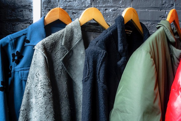
Established in 2014 by Joachim and Carly Lapotre, PHX Gallery undoubtedly stands as one of Chicago’s best kept secrets, and is a must-see for people whose love of Comme des Garçons reaches deeper than PLAY T-shirts and Converse collaborations. Located in Chicago’s River North neighborhood, the gallery sits inside an unpretentious—yet clean and airy—warehouse, which is also home to other small galleries and studios. 

An unassuming set of glass double doors, framed with crown molding and a set of Venetian blinds, diligently protected the gallery from prying eyes. Image: PHX Gallery

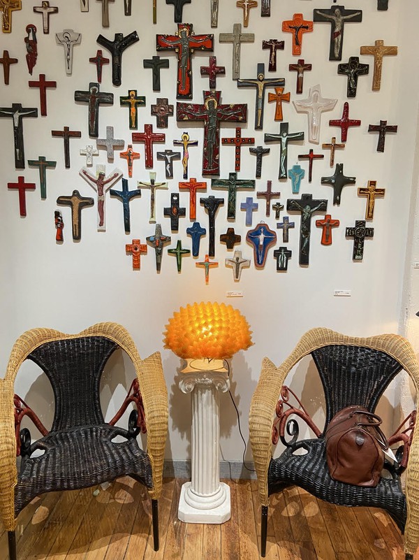
A warm, intelligent, and funny Parisian, Joachim led me to an unassuming set of glass double doors, framed with crown molding and a set of venetian blinds that diligently protected the gallery from prying eyes. The moment Joachim opened the door, I was immediately immersed into a world where fringe fashion and furniture are the rule, not the exception. A small, intimate space looking out onto the street and the building across the way, the room is the perfect setting in which to learn about Comme des Garçons and post-modernist furniture. Immediately to the left of the doors, a set of Prorok rattan armchairs by Borek Sipek for Driade from the late 1980s nestled protectively around a glowing and tactile yellow foam lamp by Masayo Ave for Antonangeli Illuminazione from the 1990s, which itself was perched upon a miniature white ionic column. In one of the chairs rested a sophisticated leather Boston bag from Comme des Garçons, and this entire scene was backdropped by mid-century ceramic wall crucifixes from Belgium. 

image
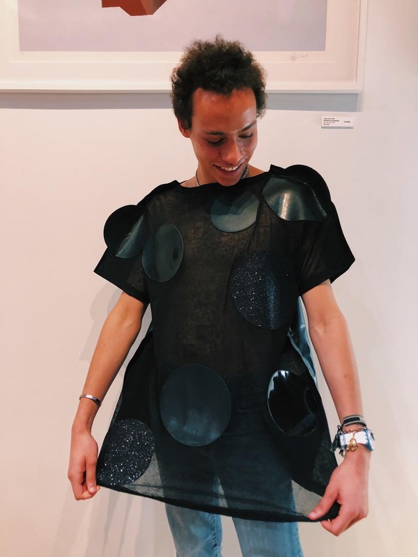
The feeling and visual gravity of the curious sheer black linen dress by Watanabe for Comme des Garçons from 2014, alternating from mesh to faux leather circles placed seemingly at random, were incredible. Image: PHX Gallery

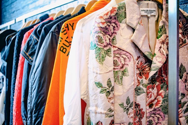
After I took in this magnificent scene, Joachim walked me through the multiple racks of vintage Comme des Garçons clothing, which encapsulate almost 40 years of Japanese avant-garde design from Rei Kawakubo and perhaps her most famous disciple and collaborator, Junya Watanabe. Describing the myriad of ways in which Kawakubo subtly (and not so subtly) defies conventional ideas of gender, form, and design, Joachim’s passion shone brightly and enveloped me further in the fantastic world of Comme des Garçons. Stopping at one particular piece, a curious sheer black linen dress by Watanabe for Comme des Garçons from 2014, Joachim encouraged me to try it on, an invitation I accepted without hesitation. The feeling and visual gravity of the garment, alternating from mesh to faux leather circles placed seemingly at random, were incredible.  

image
The feeling and visual gravity of the curious sheer black linen dress by Watanabe for Comme des Garçons from 2014, alternating from mesh to faux leather circles placed seemingly at random, were incredible. Image: PHX Gallery

Another standout that highlighted Kawakubo and Watanabe’s interest in creating seemingly ordinary clothes  was an asymmetric “hooded shirt” from 2011. What seemed from the front to be an ordinary button-down shirt, revealed itself upon closer inspection to be a hoodie, with orange stripes on the front and a red polka dot pattern on the back. Conversation about avant-garde Japanese clothing could have lasted forever, but we eventually began discussing the equally impressive collection of furniture and objets d’art placed throughout the room.

image
I was immediately immersed into a world where fringe fashion and furniture are the rule, not the exception. Image: PHX Gallery

After being introduced to Memphis Group, Ettore Sottsass, and the postmodernist furniture movement through a 2018 show in New York’s chic SoHo district titled Raquel’s Dream House (curated by Raquel Cayre, who runs the fabulous Instagram account @ettoresottsass), I became a veritable fan of postmodernist furniture and objects. To that end, Joachim and I eagerly discussed Memphis Group legends such as the Super Lamp by Martine Bedin and the Carlton bookcase designed by Sottsass himself, all the while immersed in a constellation of post-modernist creations including the Shiva Vase Prototype from 1973 (which you have to see to believe), several Keith Haring rugs, and a few curious glass and ceramic vases, which were in turn interspersed between a collection of prints by Memphis veteran Nathalie Du Pasquier. A particular highlight of this unparalleled collection was the selection of lighting: a Divan 2 Pendant by Simon Henningsen for Lyfa hung in one corner, casting striking shadows upon the white walls, while a Murano Glass Lamp by Angelo Mangiarotti for Pollux Skipper rested on the floor, creating oblong rings of warm, yellow light across the wooden boards. A designer in his own right, Joachim revealed to me several of his own designs, ranging from delicate, glass blown vases to large, geometric, ceramic sake pitchers.  

From a visitor’s perspective, perhaps the greatest joy of PHX Gallery is that most things are for sale. After scheduling an appointment to browse all that’s on offer, guests can join the list of PHX’s clients in purchasing rare and covetable pieces of design history. In fact, it seems that the only person in the gallery who cannot take pieces home is Joachim himself, who declared with admirable restraint: “Curators cannot be collectors.” 

image
Seemingly ordinary clothes take on a more astonishing significance upon closer inspections. Image: PHX Gallery
Tagged : / / / / /

Three Sustainable Brands Forging Unique Identities

It goes without saying that the fashion industry is undergoing a critical moment of self-evaluation regarding its sustainability practices. Almost daily it seems, new brands are emerging with the goal of creating clothing that is environmentally conscious and ethically sustainable. In fact, a quick google search will reveal hundreds of clothing brands at various price points that occupy this new space of “sustainable fashion”. So why, when there are so many environmentally and ethically conscious brands out there, does it seem that this category of clothing has adopted a single, refined aesthetic consisting mainly of earthy tones, simple cuts, and unexciting silhouettes? Wanting to call attention to this self-imposed creative barrier, I looked at three ethically and environmentally sustainable clothing brands with unique visual identities, proving that sustainable clothing does not require its own proprietary aesthetic that visually separates it from fashion more generally.

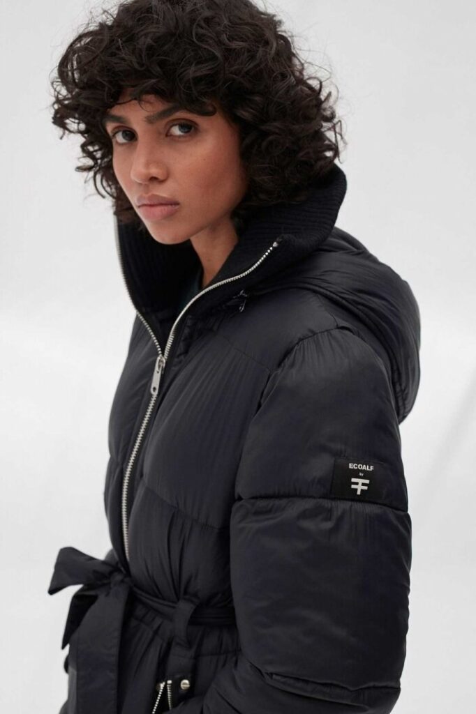
With a statement about resisting the aesthetics of sustainability on it’s own website, ECOALF sets out with the intention of creating on-trend clothing from recycled materials. Amongst the wide range of products ECOALF offers, are gorgeous and durable winter coats in a variety of shapes and color ways, and graphic tees with provocative imagery and statements. ECOALF also offers a selection of visually interesting, yet functional, bags and backpacks. Happily, ECOALF’s price range is quite wide which makes it accessible to shoppers of most budgets, though it should be noted that sustainably sourced clothing tends to be more expensive, in part because its producers are paid living wages.

Stylish winter coats are a trademark of ECOALF. Image  Via
Stylish winter coats are a trademark of ECOALF. Image Via

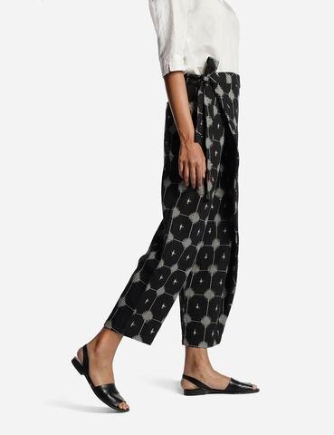
At a decidedly higher price point, Matter Prints is a purveyor of sustainable and ethical clothing and accessories that specializes in creating basic clothing in sophisticated but relaxed prints and patterns. Though it is true that the shapes of the pieces are largely uninteresting, the bold, eye-catching patterns applied to the pieces add visual excitement and prevent Matter from falling into the monotony of the traditional sustainable aesthetic.

Sophisticated yet fun prints define Matter Prints’ aesthetic. Image  Via
Sophisticated yet fun prints define Matter Prints’ aesthetic. Image Via

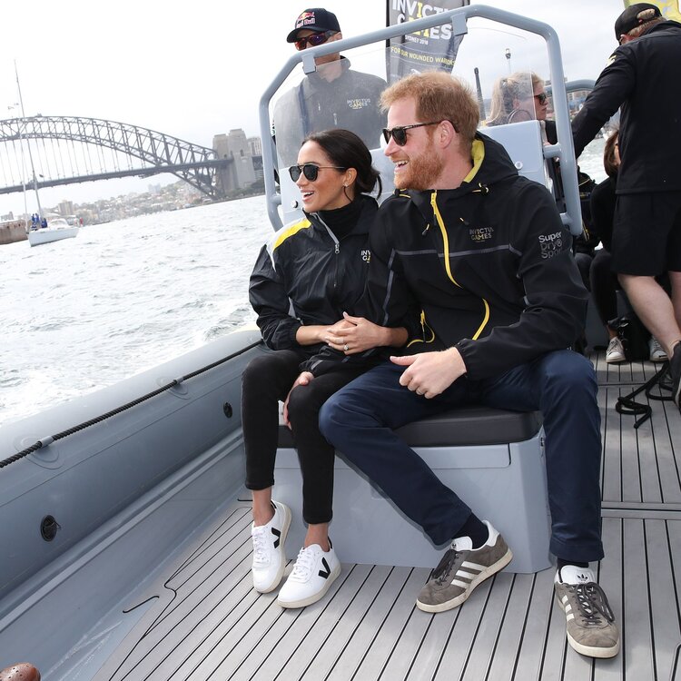
Having skyrocketed in popularity over the last several months, it is an understatement to say that VEJA Sneakers deserves a spot on this list. Founded 15 years ago after troubling evidence emerged concerning the conditions of shoe production around the world, VEJA has remained committed to producing ethically sourced, environmentally conscious vegan shoes made from rubber and recycled plastic bottles among other materials. Ironically, VEJA is so good at designing and producing fashionable, comfortable shoes, that many people who know of the brand are unaware of its mission of sustainability. In this regard, VEJA is an exemplary sustainable fashion brand that has established its own visual identity without feeling it necessary to make explicit ties to sustainability. Prices for VEJA shoes range between $95 and $200 making them expensive, but not out of the realm of reasonability for sustainable clothing.

Meghan Markle wearing VEJA trainers. Image  Via
Meghan Markle wearing VEJA trainers. Image Via

There must be a reason why sustainable clothing brands have largely tried to assimilate under a set of shared aesthetic principles, but as was the case with electric vehicle designers working too hard to ensure that their designs “looked electric”, the bid to visually distinguish sustainable fashion from the larger sphere of fashion may serve to alienate customers who care for the environment but don’t feel that it is necessary for their clothes to announce that care. For those who care about the survival of humanity but fear being labeled a treehugger, there is ECOALF, Matter Prints, and VEJA.

Featured Image via
Tagged : / / / /

Richard Mille To Open a Boutique in Chicago

657CABB6-EA1C-44E7-99D2-B02EE898F8BC.JPG

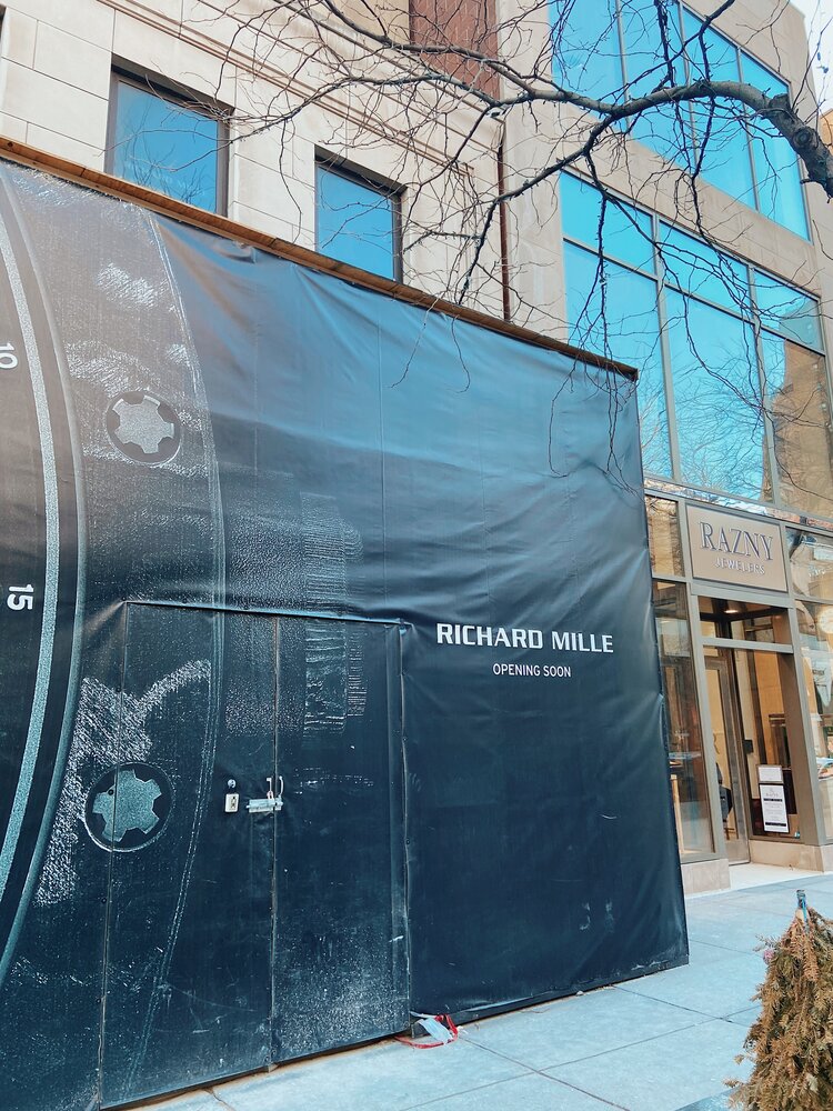
Strolling along the world famous Oak Street in Chicago’s Near North Side, one passes the storefronts of legendary labels such as Moncler, Van Cleef & Arpels, Graff, Harry Winston, and Chanel. Historically, an Oak Street address has been a marker of success for jewelers and watchmakers, and it appears that the avant-garde watchmaker Richard Mille intends to keep this tradition with its imminent opening set to occur at 109 East Oak Street. This location will be RM’s sixth in the United States, as currently only Geneva Seal on Oak Street is authorized to sell Richard Mille products, and will further efforts toward solidifying Chicago as a city with an entrenched watch scene. Having little more to go on than a temporary shroud over the storefront announcing its future presence adjacent to Razny Jewelers, perhaps a proper introduction to Richard Mille is in order for Chicagoans.

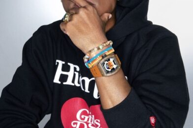
First and foremost, Richard Mille is known for its aesthetically and materially revolutionary timepieces inspired by and used in Formula 1. In fact, the brand’s founder, Richard Mille, introduced his first timepiece in 2001 after leaving Mauboussin citing creative constraints. In the late 1990s and early 2000s, a particular sect of people in watchmaking became discontent with the constant production of watches that were advanced technologically, but all more or less resembled one another. Founded in 1991, it was really Franck Muller who broke the glass ceiling and, with strong sales and famous clientele, proved to the watchmaking world that expensive watches need not necessarily also be serious watches. Owing much to Franck Muller but naturally taking watchmaking to the next level, Richard Mille has from its beginnings been a brand inspired by Formula 1, and this is reflected in everything the brand does, from the naming schemes of its pieces, to sponsoring F1 teams and drivers, and even in its advertisements, where Richard Mille refers to its products as “A racing machine on the wrist”. As pertains to advertising, Richard Mille is famous for gracing the wrists of celebrities from many different spheres, including Margot Robbie, Felipe Massa, Rafael Nadal, Romain Grosjean, Bubba Watson, and Pharrell Williams, with Watson and Pharrell lending their names to special edition RM’s.

Formula 1 Driver for Ferrari, Charles Leclerc is partnered with Richard Mille. Image via

At this point, it’s important to address the elephant in the room, and that’s the astronomical price tags attached to any Richard Mille product, price tags which are especially difficult to justify considering that RM is such a young brand. Though any piece serves as a fine example, it seems that the public has been especially shocked by Richard Mille’s sapphire pieces, or pieces like the RM 19-02, an artistic watch which houses a tourbillon complication inside of a flower bud, the bud opening to reveal the complication at the push of a button. The sapphire pieces regularly retail for over $1.5 million U.S. dollars, while the RM 19-02 is not far behind at $1.1 million U.S. Though many would say that there is no explanation for such eye-watering prices, Richard Mille, a company at which each piece is produced through a revolutionary process, with revolutionary materials, and in small quantities, the costs of production are obscenely high. Each sapphire watch RM produces, for example, is machined from a single block of sapphire, taking more than 1,000 hours for the piece to go from raw stone to watch case. Not only is it incredibly difficult and expensive to source such a large piece of sapphire, but the machinery necessary for transforming raw sapphire into a watch case is in itself rather costly. Adding to this the fact that Richard Mille insists on manufacturing unique components, down to the screws, for nearly all of its products, the high cost of entry into this brand is more understandable.
The RM 56-02, a Sapphire Richard Mille.  Image  Via
The RM 56-02, a Sapphire Richard Mille. Image via

All of this to say, regardless of one’s opinions on how much is too much to pay for an object essentially meant to tell time, Chicago’s watch scene has much to gain from the opening of this legendary, cutting edge marque. Though no official details have been released concerning the date at which the boutique will be opened, it is safe to say that I remain anxious for the not-too-distant day when the racing machine comes to Oak Street.

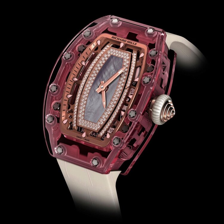
The RM 07-02, a Sapphire Lady’s watch that gained infamy for its $1 million+ price tag.  Image  Via
The RM 07-02, a Sapphire Lady’s watch that gained infamy for its $1 million+ price tag. Image via

Featured Image via

Tagged : / / / / /

Fashion and the Attention Economy

In an era defined by attention-seeking, pop-art inspired designer clothing, where immediate brand recognition and camera-readiness take precedence over the quality of a garment, it is easier than ever before to dismiss the work of a designer or creative director who values the depth and integrity of a piece of clothing more than its ability to make a fleeting impression on the street. 

The current state of streetwear. Image  Via
The current state of streetwear. Image via 

Viewed primarily through YouTube videos and Vogue Runway stills, it is the designers who give deference to the feel and sounds of a garment, qualities which cannot be captured by photography, who are pushed to the periphery of the collective sphere of fashion, while monogrammed tracksuits and logo-covered handbags are showered with seemingly endless affection. And, while I dare not claim complete immunity to logomania, in writing this article I hope to pique interest in the less considered aspects of clothing, such as texture, sound, and context. 

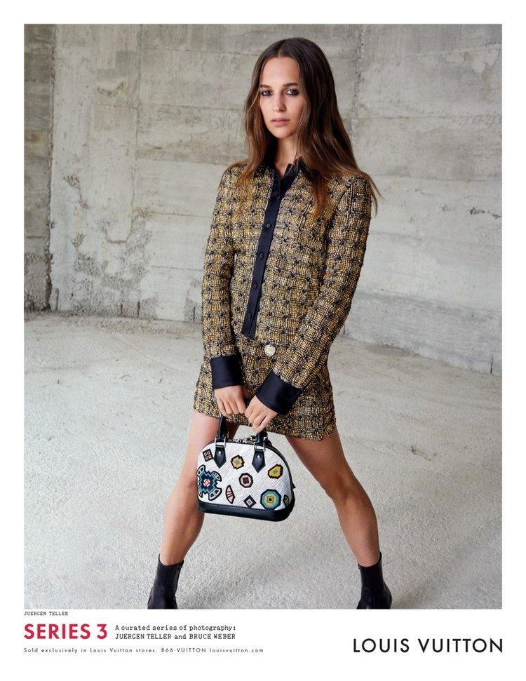
One lovely fall afternoon, desperate to avoid schoolwork, I wandered into Powell’s Bookstore on 57th street and went to the fashion section, where I happened upon two photo-books by the accomplished Juergen Teller for Nicolas Ghesquière at Louis Vuitton. Flipping through the pages of Season Three, which documents Louis Vuitton ready-to-wear from 2015, I became lost in the intense textures and sculpture of the garments which could only be thoughtfully appreciated in these intimate, close-up photos or in person. The difference between viewing Ghesquière’s work this way and viewing it through somewhat anticlimactic YouTube videos or stills was dramatic; this series of photos transformed an indifferent viewer of Ghesquière’s work into a bonafide fan, and led me to become a regular window-shopper along Chicago’s Rush and Oak streets, where I began to examine and understand the three-dimensional, layered beauty in Maria Grazia Chiuri’s couture, and felt the magnificent texture of Goyard’s eponymous Goyardine canvas. In the case of M.G.C.’s work at Dior in particular, critics have been quick to point out the apparent lack of visual excitement and engagement that her couture offers to viewers, forgetting that couture is first and foremost designed and constructed for the sensorial enjoyment of the wearer, and as such the time needed to create these intricate garments can easily exceed 140 hours. It seems, though, that by and large, the public fails to acknowledge the process and simply critiques the raw visual impact of the final product, and this is perhaps the most devastating symptom of the emphasis on visual excitement in fashion.

One of a series of intimate portraits by Juergen Teller for Louis Vuitton, 2015. Image  Via
One of a series of intimate portraits by Juergen Teller for Louis Vuitton, 2015. Image via

This tactile exploration of carefully considered textures and sounds in clothing put me on the path toward finding other brands that held often-overlooked qualities of clothing in high regard. The work of Japanese designers like Keisuke Konda, who once famously used rice bags to create clothes with unique textures, and Mint Designs, a brand which emphasizes the unique qualities of different fabrics and textiles rather than focusing primarily on the form and cut of a garment, as is the modus operandi for both European and American designers. In focusing on the process of garment construction itself, which necessitates considering every facet of a piece of clothing equally, avant-garde Japanese designers in particular, Rei Kawakubo and Issey Miyake among them, have excelled in reframing what makes a piece of clothing remarkable.

Mint Designs, Tokyo Fall 2020. Image  Via
Mint Designs, Tokyo Fall 2020. Image via

As my search for clothing and designers that seek to connect with their audience on a deeper level than simply visual continues, I encourage those who make quick judgements about a designer’s talent based on photos or videos to visit one of their boutiques in person or at the very least consider the context and complexity of their creations before writing them off; after all, who knows how many wonderful designers and garments we have dismissed in the past simply because we were too lazy and dismissive to consider them for longer than the runtime of an FF Channel video? While the world around us becomes ever more digital and streamlined, it is more important than ever before to advocate for quality, texture, and variety in fashion.

Cover image via

Tagged : / / /

How The Resurgence of Vintage Clothing Is Engaging A New Generation

Right now, the fashion community is coming out of a significant period of time in which newness and futurism were key selling points and design inspirations; from new trends like designer sneakers and celebrity collaborations with established watchmakers to the monster of fast fashion, it’s safe to say that we have been conditioned to expect new designs and trends from the fashion sphere on a near daily basis. And, while one could argue that this constant release of new products has its merits, I want to focus on the fact that this way of life has led an entire generation of fashion admirers to unflinchingly look forward, rarely pulling from fashion’s long and illustrious history to find style inspiration. In my opinion, and one which is held in common with many of my peers, this phenomenon of constantly looking forward for design inspiration has led to a proliferation of unimaginative, drab, and forgettable movements and collections in fashion. However, thanks to recent international interest in vintage fashion, young people immersed in the world of clothing design are beginning to rediscover fashion’s most iconic moments through dedicated vintage instagram accounts, physical vintage stores, and resale apps, and this has led to renewed interest in creating collections which are been unabashedly inspired by the past. In this piece, we will honor the social media accounts and stores which have made this revolution possible in part to give credit where credit is due, and in larger part, to inspire our readers to look back in addition to looking forward.

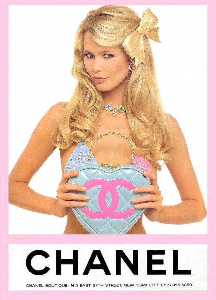
SuperModel Claudia Schiffer holds bag from Chanel Spring/Summer 1995. Image  Via
SuperModel Claudia Schiffer holds bag from Chanel Spring/Summer 1995. Image Via

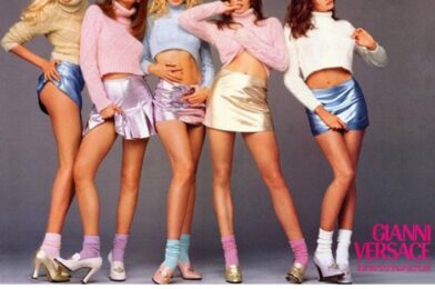
Before listing the vintage accounts which offer items for sale, I thought it more appropriate to point readers in the direction of several accounts which exist for the purpose of reminding us just how great the last 20-30 years in fashion were. Though I’m sure many accounts of this sort exist, I will highlight my favorite three, starting with @diorbyjohngalliano. Being partial to Dior when it was under the creative direction of John Galliano from 1996-2011, I am definitely biased in saying that this account is the best of them all; with campaign ads, runway clips, runway photos, and highly detailed captions, this account which boasts over 61 thousand followers is truly exemplary. In a very similar vein, the next account worthy of your follow is @diorinthe2000s. Because Dior was under the creative control of Galliano throughout the 2000s, many of the images on this account have a similar look to those found at @diorbyjohngalliano and have very detailed captions as well. One large difference between the two accounts, the difference which I think makes them both worth following, is that @diorinthe2000s focuses much more on Galliano’s ready-to-wear contributions than @diorbyjohngalliano does. The final archival account that I am enthralled with is @datewithversace, an account I credit with engendering my love for the house of Versace; this account mainly posts ad campaign photos, though it also sprinkles in action shots from the runway, and it does a great job highlighting the golden age of Versace beginning in the 1990s. Perhaps what’s even more exciting about this revival of love for vintage fashion is the rise of physical and online shops which deal exclusively in rare, historic pieces.

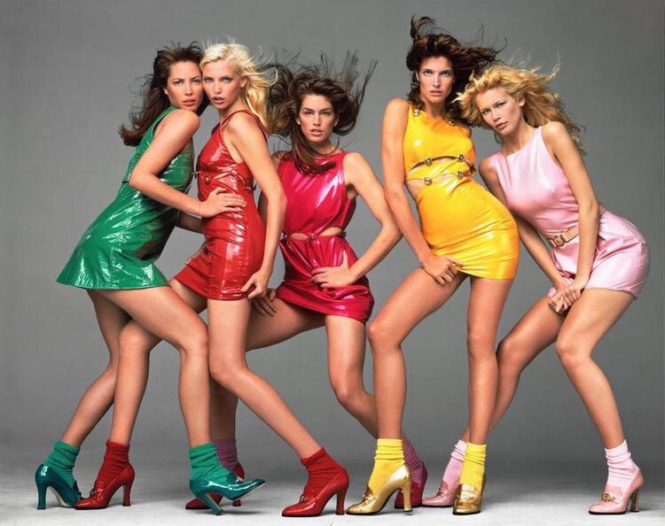
Gianni Versace 1994 modeled by Christy Turlington, Nadja Auermann, Cyndy Crawford, Stephanie Seymour, and Claudia Schiffer. Shot by Richard Avedon. Image  Via
Gianni Versace 1994 modeled by Christy Turlington, Nadja Auermann, Cyndy Crawford, Stephanie Seymour, and Claudia Schiffer. Shot by Richard Avedon. Image Via

Even before Kylie Jenner and her friends began posting photos of themselves wearing vintage Chanel and Dior pieces on yachts in exotic locales, instagram accounts like @pechuga_vintage and @whatgoesaroundnyc (whose Senior Vice President is @ambriany and whose Head Luxury Buyer is @paigerubin) had been revisiting, collecting, and selling iconic and rare pieces from fashion’s past. Through detailed photos, descriptions, and captions, these instagram accounts and many more use the profession of vintage luxury resale to introduce younger generations, and remind older ones, of the daring, provocative, and extravagant clothes and accessories of the 1990s and 2000s. For those of us who like to interact even more intimately with vintage pieces, there are rare shops like @treasuresofnyc in New York’s NoHo, which has a small physical space in which to look at, touch, and buy unique pieces from brands like Chanel and Dior, also boasting a fashion themed coffee shop on the ground floor of the building (@coffeenclothes).

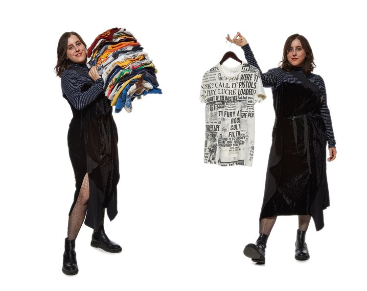
Paige Rubin (@paigerubin) holds a stack of clothes (left) and a Galliano era Dior top (right). Image  Via
Paige Rubin (@paigerubin) holds a stack of clothes (left) and a Galliano era Dior top (right). Image via

 It would be easy for a person to spend hours getting lost in the feeds of these instagram accounts as I often have, and it is my honor to share them with you. Now that the fashion world has once again recognized the value of its past, we can all look forward to more engaging collections which succeed in uniting the past, the present, and the future.

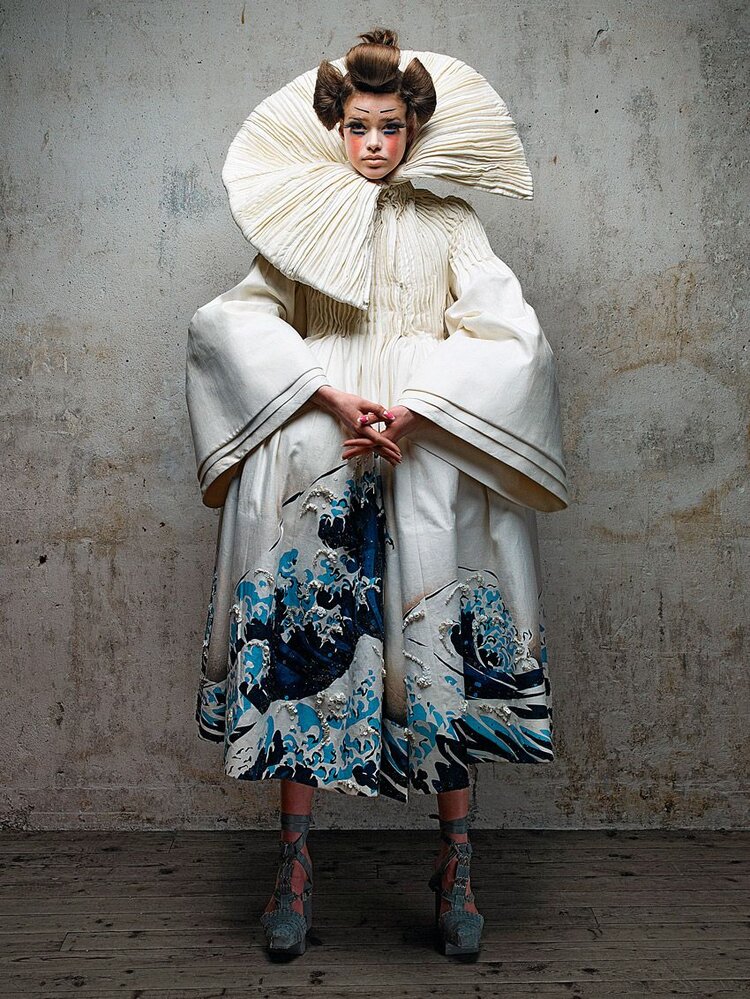
Dior Couture Spring/Summer 2007. Image  Via
Dior Couture Spring/Summer 2007. Image via

Feature image via

Tagged : / / / /

Bringing Mexican Mid-century Modernism to the Fore

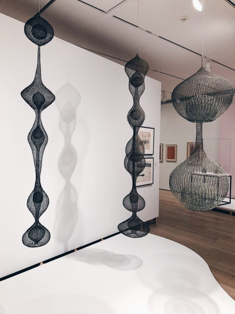
Ruth Asawa's famous looped-wire sculptures, currently on display at the Art Institute of Chicago.
Ruth Asawa’s famous looped-wire sculptures, currently on display at the Art Institute of Chicago.

For those not well-versed in the history of design, midcentury modernism carries associations with places like Germany, Sweden, and Southern California, but the link between modernism and Mexico is less obvious. The Art Institute of Chicago’s exhibition In a Cloud, in a Wall, in a Chair: Six Modernists in Mexico at Midcenturyseeks to change that. By showcasing the works of six artists (Clara Porset, Ruth Asawa, Cynthia Sargent, Sheila Hicks, Anni Albers, and Lola Álvarez Bravo) who lived or worked in Mexico between 1940 and 1970, this exhibition encourages conversation around Mexico’s contributions to modernism by locating the commonalities between these artists. 

The exhibition takes its name from a quote by Clara Porset, who immigrated to Mexico in 1935 as an exile from Cuba. During her 1952 exhibition, Art In Daily Life, Porset declared, “There is design in everything…in a cloud, in a wall, in a chair, in the sea, in the sand, in a pot.” Along with the other artists on display, Porset was working at a crucial time in Mexico’s design history, a time when the Mexican government was working to establish a recognizable and cohesive design identity.  

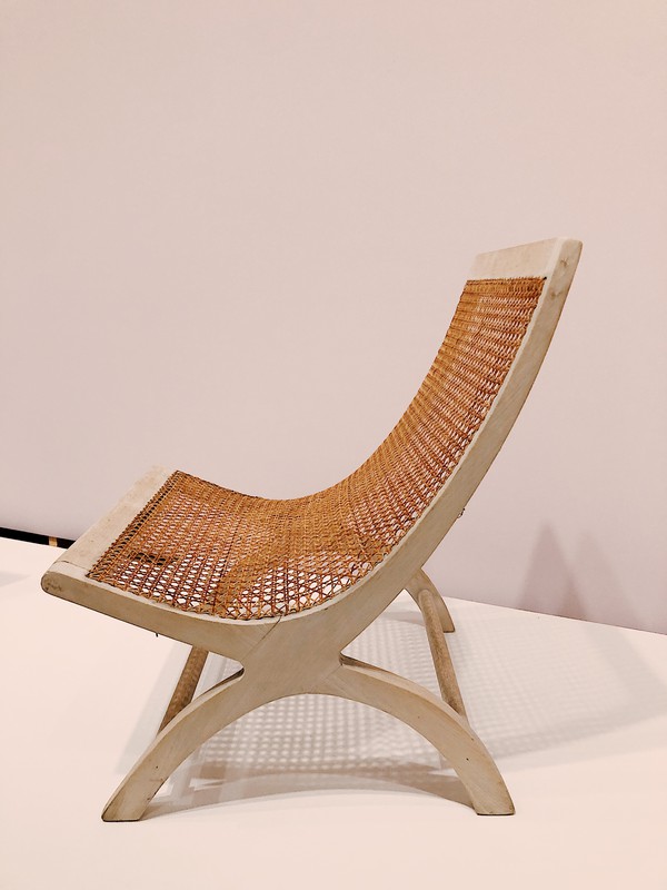
Combining traditional Mexican craft methods with newer, technologically driven techniques, Porset took her vision to the public, using furniture to express the daily lives of Mexicans. Porset’s Lounge Chair, for example, was conceived in the 1950s and was used for decades at Acapulco’s famed Pierre Mundo Imperial hotel. One of Porset’s most famous works, the Butaque Chair, infused new life into a traditional Latin American design by incorporating materials such as plant fibers and leather which made the chair suited to Mexico’s different climates. In line with the modernist ideals of the time, Porset also worked to ensure that her versions of the Butaque Chair were mass-producible and affordable. 

image
Clara Porset’s Butaque chair, on display at the Art Institute of Chicago.

In contrast to Porset, the works of Ruth Asawa were not primarily functional, but rather overtly sculptural. Like several of the other artists exhibited at the Art Institute, Asawa spent her formative years at Black Mountain College in North Carolina, where she initially began exploring looped wire as a means of creating minimalistic, organic forms. It was only after her move to Mexico that Asawa learned her defining crochet loop technique, initially employed for the creation of egg baskets, but later used to produce wire sculptures. Reminiscent of the movement of water or even a spider’s web, these looped-wire sculptures can be seen hanging from the ceilings of many museums and public spaces, notably the new Whitney Museum in New York. 

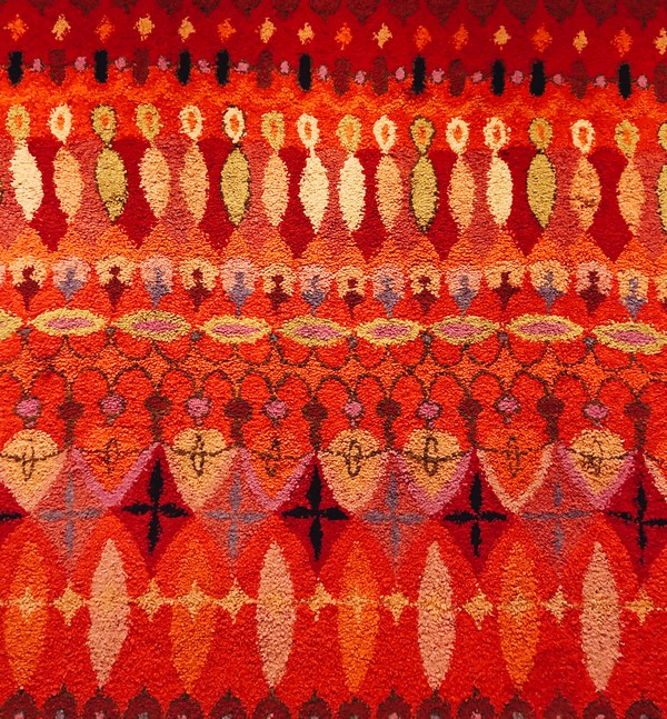
Moving on, Cynthia Sargent came into Mexico’s art and design scene in the 1960s after moving away from New York with her husband and artistic collaborator Wendell Riggs. Creating rugs with colorful, flowing, asymmetrical motifs, Sargent aimed to elevate tried and tested Mexican design practices, even contributing some pieces to Porset’s Art In Daily Life. Known also for her business savvy, Sargent founded the Bazaar Sábado in 1960, a weekend place of commerce still in operation, showcasing the works of artists of many places of origin. Sargent and Riggs also worked together to form the eponymous Riggs-Sargent, a company that created scalable lines of fabrics favored among the Mexican elite. As may be obvious in her work, Sargent’s asymmetrical motifs often evoke musical rhythms and were even given titles which referenced the names of famous European composers, a move that helped her gain favor with clients who considered themselves to be worldly.  

image
Colorful and asymmetrical motifs on Cynthia Sargent’s rugs, on display at the Art Institute of Chicago.

The show also featured the works of Sheila Hicks, another notable name in Mexico’s mid-century scene. Feeling a connection to Mexico’s strong lineage of weaving, Hicks sought to deconstruct her own pieces to reveal the many parts and individual threads, often pulling apart the threads at the center of each work to allow light to pass through. “Any good weaver would look at this and say, I don’t think this lady knows how to weave,” she said. In Hicks’s works then, it is the means rather than the end—the act of weaving rather than the product woven—that is central to the work. 

Anni Albers, meanwhile, was a student of the revered Bauhaus, now synonymous with functional modernism, visual restraint, and abstraction. Having fled to the United States in 1933, Anni and her husband Josef Albers began teaching at Black Mountain College in North Carolina where she met Porset. Having grown fond of Mexico through Porset, the Alberses visited Mexico several times throughout the 1960s, contributing much to its abstract modern design scene. Notably, Albers realized that the abstract forms and patterns that she adored and created had existed well before her time in Indigenous Mexican and American weaving. Inspired by this history, Albers sought to combine the modern with the ancient in her designs, which were eventually mass produced and sold by Knoll throughout the 1970s. 

Last but surely not least is Lola Álvarez Bravo, whose work stands out even among this distinguished group for both its medium and its message. Álvarez was a modernist in every conceivable meaning of the word: Working in photography throughout the 1950s, Álvarez sought to capture the energy and potential for modernization through photographs depicting Mexico’s industrialization. By collaging separate photographs into photomontages, Álvarez projected her socialist ideals while celebrating both the practical need for industrial modernization and the cultural need to retain Mexico’s longstanding and rich traditional modes of production.  

Alvarez’s work is not only interesting in its expression of socialist and modernist Mexican thought, but also in its placement within the exhibition as a whole. The first thing one sees upon entering the double doors of the gallery is a floor-to-ceiling photomontage in landscape format, depicting industrialists hard at work in the 1950s. These photomontages permeate the entire gallery, constantly contextualizing the work of each artist within the practical concerns of the time of their production, beautifully and thoughtfully synthesizing the idea of industry and production as art. 

It is frankly remarkable to find that only one of the six artists on display was actually born in Mexico. The fact that five modernists between 1940 and 1970 fell so deeply in love with Mexico, its traditions, and their potential for modernist applications serves to highlight the injustice of marginalizing Mexico’s indelible impact on design during this period. Though long overdue, it is a step in the right direction to highlight the culturally and geographically specific contributions of these artists to the greater conversation of what it meant to be modern in 20th-century Mexico. 

In a Cloud, in a Wall, in a Chair: Six Modernists in Mexico at Midcentury is on view until January 12, 2020 in the Modern Wing. 

Tagged : / / / / /

A Painful Goodbye To Barneys

At a cursory glance, it’s easy to dismiss the fate of Barneys New York as just another department store lost to the ruthless and unstoppable advance of online shopping and overnight shipping. Though many shoppers might liken Barneys to a number of other high end department stores like Saks Fifth Avenue, Neiman Marcus, or Bloomingdale’s, Barneys carried a heftier cultural importance, acting as a hub to connect celebrities, aspiring designers, and creative minds alike. It is with the golden era of Barneys New York in mind that we honor it with this swan song.

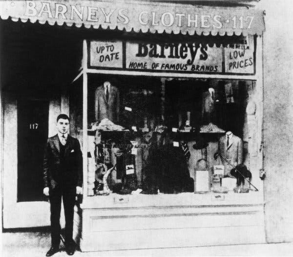
Barney Pressman in front of his first store, Image  Via
Barney Pressman in front of his first store. Image via

Opened in 1923 as a designer label discount store for men at the intersection of 7th Avenue and 17 Street in Manhattan, Barneys, named after its founder Barney Pressman, grew rapidly and eventually opened a women’s department in the 1970s. In 1993, Barneys once again created waves in the high-end department store scene with the opening of their then-new 230,000 square foot flagship location on Madison Avenue in Manhattan, but the news wasn’t all good. Just after the opening of the new flagship store, customers and window shoppers began complaining about an atmosphere of prideful exclusion and unattainability which was reflective of Barneys tone deaf approach to luxurious living at this time. Unsurprisingly, Barneys’ inability to reflect the values and desires of its customers led the brand into its first bankruptcy filing in 1995, resulting in significant downsizing and the closure of two stores in Texas and one in Michigan. Though Barneys began to rebuild itself in its former image after coming back from the brink of extinction for the first time, the store was placed under new management in 2010, management which amplified the commercial aspects of the business without also elevating Barneys defining quirky qualities. After 9 more years of alienating themselves from consumers and those who loved Barneys as one of New York’s most important cultural icons, Barneys New York filed for Chapter 11 bankruptcy for the final time, in August of this year, citing, amongst other causes, unreasonable rent and low foot traffic. But despite the unfortunate ending of Barneys New York, there is much to celebrate about the storied luxury titan.

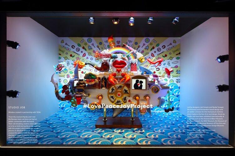
Perhaps its greatest contribution to fashion, Barneys New York consistently gave a voice and a platform to unique, emerging young designers and had a pivotal role in launching the careers of people like Giorgio Armani and Rick Owens. In fact, throughout most of its glorious history, Barneys defined New York fashion more than any other department store. After all, it was Simon Doonan, brought onboard in 1986, who designed Barneys’ now iconic window displays, elevating the craft to the art sphere, and injected the store’s spaces with whimsical, and sometimes outright comical, displays and curated items. Barneys, and Neiman Marcus to a lesser degree, has always been a place where one could shop from storied and established fashion houses whilst at the same time discovering new and daring brands. It was, in part, this atmosphere of the unexpected and perpetually exciting that made Barneys a social hub for celebrities and socialites the world over. Barneys was as much a destination for shopping as it was a destination for making new friends and meeting old ones, and this simply doesn’t ring true with the other noteworthy players in this space such as Neiman Marcus, Bloomingdales, and Saks Fifth Avenue. All of these stores, which have succeeded in fulfilling the basic functions of selling luxury clothing on a large scale, have failed to create a brand identity as strong as Barneys. 

Simon Doonan, Creative Director to Barneys New York with monogrammed Goyard trunk. Image  Via
Simon Doonan, Creative Director to Barneys New York with monogrammed Goyard trunk. Image via
A window display at Barneys New York. Image  Via
A window display at Barneys New York. Image via

So, having been bought by Authentic Brands Group and B. Riley at a cost of over $271 million, Barneys inventory is currently being liquidated at all of its open locations. In recent weeks, people have inundated store in droves to take it all in one last time, doing everything in their power to remember the sights, sounds, and smells of one of the most culturally impactful stores in New York. The spirit of Barneys will always live on, especially as so many now established brands have the store to thank in part for their success, but also because of the many passionate fans who refuse to let the memory of Barneys fade. If you find this news painful as I do, I suggest following @thespiritofbarneys on instagram, or visiting Saks Fifth Avenue who apparently secured the rights to the Barneys name and may have plans to open mini-Barneys’ inside several locations. One thing is certain—Chicago’s Oak Street, home to our local Barneys location, will never be the same.

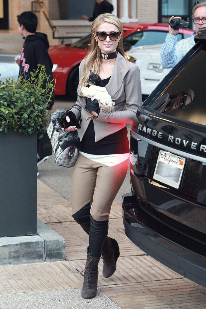
Paris Hilton arriving at Barneys Los Angeles location. Image  Via
Paris Hilton arriving at Barneys Los Angeles location. Image via

Featured image via

Tagged : / / / /

Top 10 Fashion Collabs of the Last Ten Years

With 2020 approaching, MODA Blog rounds up the best, worst, and most iconic phenoms of the 2010s.

In recent years, it seems that fashion houses have begun to realize the potential to create objects of unparalleled beauty with the help of creatives in other fields. Though the link between fashion and art may be apparent to millennials and those even younger, the idea of collaboration across the fields of fashion and art were relatively rare before the 21st century. Beginning in the 2000’s, however, collaborations in creative industries became commonplace thanks to a combination of the artistic potential and the generally positive reaction from consumers. It is with this potential for greatness in mind that we present the top ten fashion collabs of the last decade.

Number 1: Louis Vuitton x Takashi Murakami:

Image  via
Image via

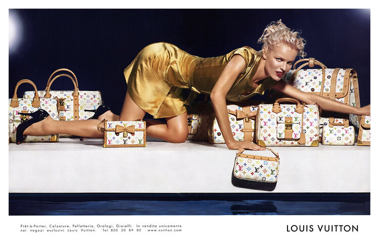
Though it is true that the relationship between Murakami and Louis Vuitton began back in 2003 with the introduction of the Murakami Multicolor Monogram collection, the close relationship between Murakami and Louis Vuitton lasted for over 13 years, extending into 2015. Chances are, even if you didn’t know Takashi Murakami collaborated with Louis Vuittion, you are familiar with the now iconic and always lusted after Multicolor Monogram bags. These bags not only defined a decade and a half of style, being worn by the likes of Paris Hilton, Jennifer Lopez, and Kim Kardashian, but they also legitimized future collaborations between artists and household name fashion giants such as Louis Vuitton.

Number 2: Louis Vuitton x Supreme:

Image  via
Image via

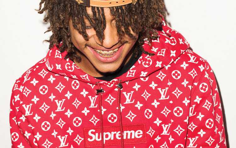
Having essentially created the evergreen trend of designer collaborations, it only makes sense that Louis Vuittion should appear on this list multiple times, and the Louis Vuitton x Supreme collaboration was just as earth-shattering as the Murakami collaboration, if not as enduring. First debuted at Paris Fashion Week in 2017, the Supreme x Louis Vuitton capsule came at the height of Supreme’s mainstream relevance, and undoubtedly widened the brand’s audience. Notably, this collaboration was launched first at pop-up locations across the world rather than in stores, demonstrating Louis Vuitton & Supreme’s willingness to adapt to the ways in which young people now shop.

Number 3: Moschino x H&M:

Image via
Image via

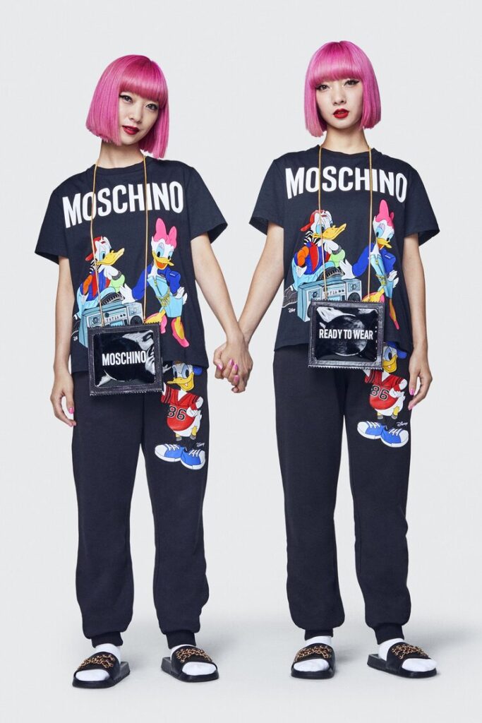
Under Jeremy Scott, Creative Director of the brand since the end of 2013, Moschino has become a go-to brand for aesthetically conscious youth who identify with Moschino’s bear motif and phone cases that elevate daily household objects to forms of art. For this collaboration, both H&M and Moschino had to pull out all the stops, with H&M dramatically raising their quality standards and Scott stretching the limits of his diverse but always recognizable style. The resulting pieces were a pleasing blend of grunge and high fashion glamour, with strong undertones of youthful rebellion. The relatively low prices for the collection were a plus, too.

Number 4: Gucci x Dapper Dan:

Image  via
Image via

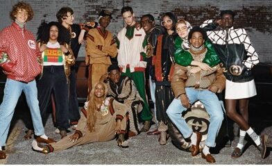
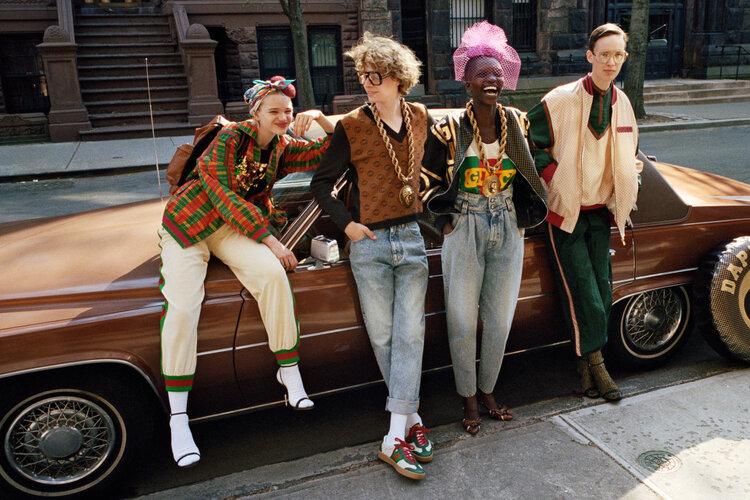
This particular story is an interesting one. Dapper Dan is and  has been an iconic African American streetwear designer based in Harlem, New York since the 1970s, counting celebrities and drug lords among his clientele. Dapper Dan was known largely for incorporating popular design houses logos into his clothes, and the iconic Gucci double G was among his favorites. This led Alessandro Michele, creative director at Gucci since 2015, to create a jacket that paid homage to a particularly famous Dapper Dan design without crediting him. Perhaps ironically, Dapper Dan and his followers were angry about what seemed like a stolen idea rather than an homage, and later in 2017, Gucci formally partnered with Dapper Dan on a line of clothes and eventually even opened a store with him in his native Harlem.

Number 5: Chanel x Pharrell:

Image  via
Image via

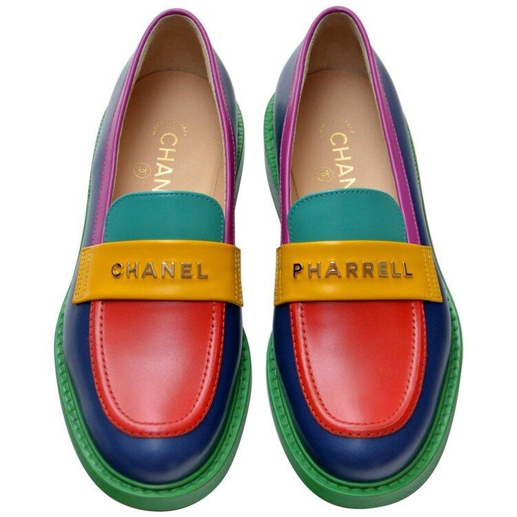
The Chanel Pharrell collection, which debuted for Spring/Summer 2019, is the quintessential example of a daring and successful collaboration. With Chanel moving away from its decidedly haute couture and formal focus, and Pharrell channeling his propensity for beautiful music into beautiful clothes, this collaboration was a risky but ultimately successful move on the part of both parties. Replete with bright colors, bedazzled logos, and a range of tactile materials, the Chanel Pharrell collection was a comprehensive take on luxe streetwear and has accordingly been worn by the likes of Lil Uzi Vert and Young Thug.

Number 6: Dior x Hajime Sorayama:

Image  via
Image via

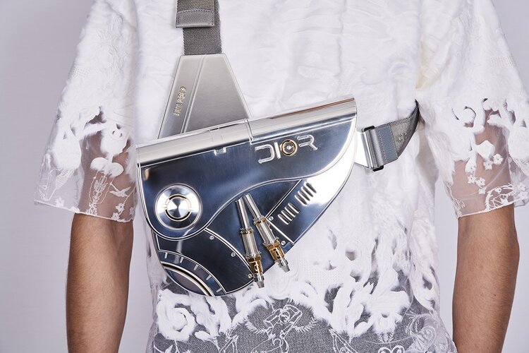
Under the creative direction of Kim Jones since 2018, Dior Homme has arguably been the fashion label most open to collaborations with intriguing artists, counting Daniel Arsham and Hajime Sorayama among them. The Fall/Winter 2019 collaboration between Dior Homme and Hajime Soroyama, though not expected, seemed rather natural; pairing Soroyama’s retro-futuristic aesthetics with Dior’s legendary oblique print on shoes, shirts, and accessories, this collaboration brought a rugged and utopian vision to the house of Dior rendered in plastic and highly polished metal. Standouts from this collaboration included an industrial and futuristic revisit of the iconic Saddle Bag, originally the work of John Galliano, as well as a fantastic take on the B23 shoe.

Number 7: Chanel x Audemars Piguet:

Image  via
Image via

Perhaps the unlikeliest collaboration on this entire list, the Chanel x Audemars Piguet collaboration is also arguably one of the most exciting. Ever since being launched in 1999, the Chanel J12 has been a must-have watch for celebrities and the fashionably conscious. Rendered in shiny ceramic, a shiny and surprisingly resilient material, the J12 was legendary in almost every way, lacking only a horologically sophisticated movement to match the sophisticated design. Luckily, in 2008, the famed watchmaker which needs no introduction, Audemars Piguet, stepped up and fit their well known mechanical Calibre 3125 movement to the J12, finally satisfying all of the requirements for a truly special watch. To distinguish the Calibre 3125 J12 from the standard J12 which comes in only black and white ceramic, the Caliber 3125 was cast in shiny black ceramic with 18k rose gold accents, and later editions of the watch were made in matte black ceramic.

Number 8: Burberry x Vivienne Westwood:

Image  via
Image via

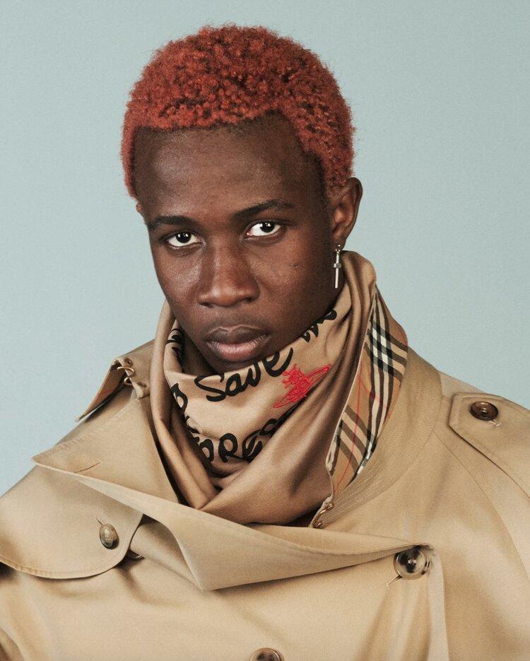
Uniting the historic English fashion house Burberry with the iconic English club-kid/punk rock oriented aesthetic of Vivienne Westwood was a move that fans of each brand will look upon fondly for years to come. Having risen to fame in the 1970s with the English punk rock movement, it is surprising that a collaboration between Vivenne Westwood and Burberry did not come about until late 2018. Featuring Burberry’s check motif overlaid with environmentally focused words written by Westwood, the collection carried a high-fashion political message while supporting the U.K. nonprofit Cool Earth. The full range of campaign photos and videos released for this collaboration are well worth a look.

Number 9: Jean Paul Gaultier x Hermès:

Image  via
Image via

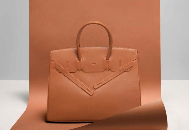
As the Creative Director of Hermès from 2003 to 2011, the daring Jean Paul Gaultier injected excitement into one of the world’s most respected and sought after leather goods brands. Though it is a stretch to call the Shadow Birkin a collaboration since Gaultier was the Creative Director of Hermès when he created it, I like to think of it as a collaboration because it unites the quirky aesthetic of Gaultier while modifying Hermès’ most famous item, the Birkin. Keeping the shape of the traditional Birkin, Gaultier removed the functionality of the flap and left the imprint of the sangles (the locking arms) on the front of the bag, without allowing them any functional purpose, hence the name Shadow Birkin. Perhaps more than any other of Gaultier’s contributions during his 8 year tenure at Hermès, the Shadow Birkin left an indelible mark on the brand.

Number 10: Louis Vuitton x Memphis Group:

Image  via
Image via

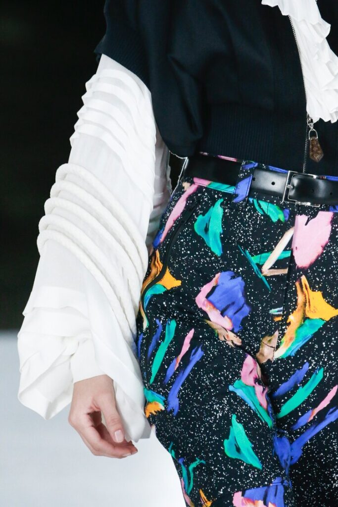
Rounding out the list is another collection that isn’t a collaboration in the strictest sense. For the Spring 2019 women’s ready to wear collection, Nicolas Ghesquière drew inspiration from the work of Memphis Group, a now largely dissolved postmodernist design collective established in the 1980’s and led by the fabulously creative Ettore Sottsass. This collaboration is very dear to my heart, as the products of Memphis Group have been an obsession of mine for several years. Ghesquière employed the use of bright colors, geometric 80s patterns, and bulky architecture to pay homage to the Group and the late Sotsass, and the final product was exceptional not only for the beauty of the clothes in themselves, but also for the fact that Ghesquière intentionally brought the legacy of Memphis Group to a younger audience.

So there’s our list.  Which collab is your favorite and which did we leave out?

Featured image via

Tagged : / /